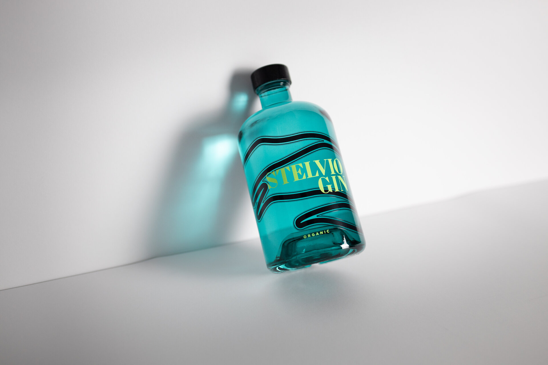
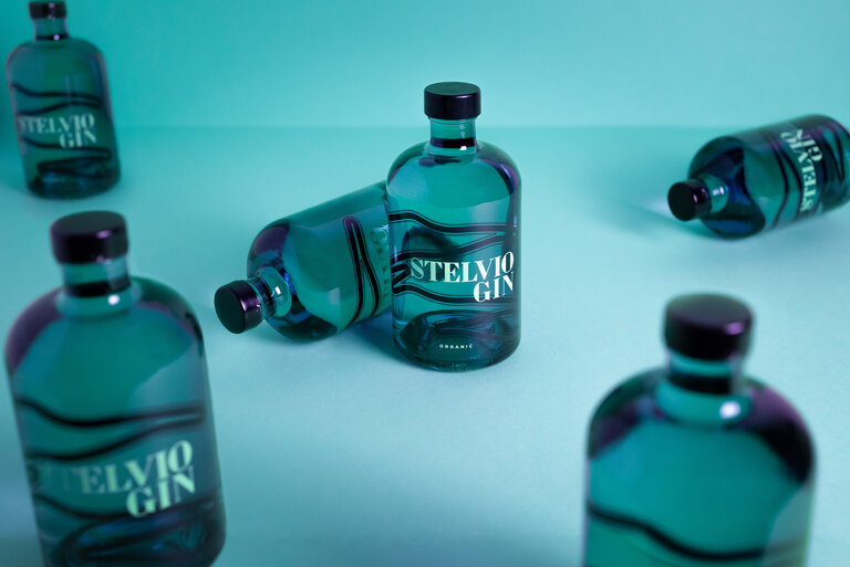
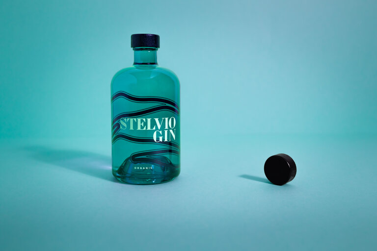
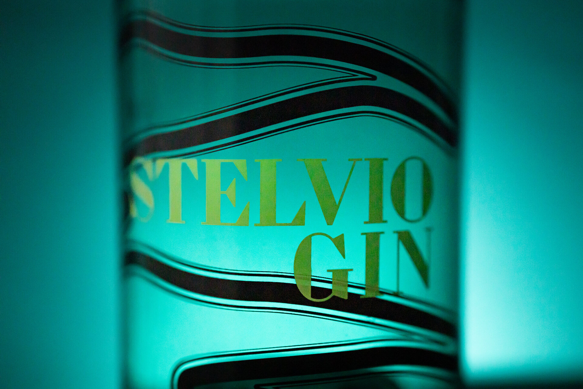
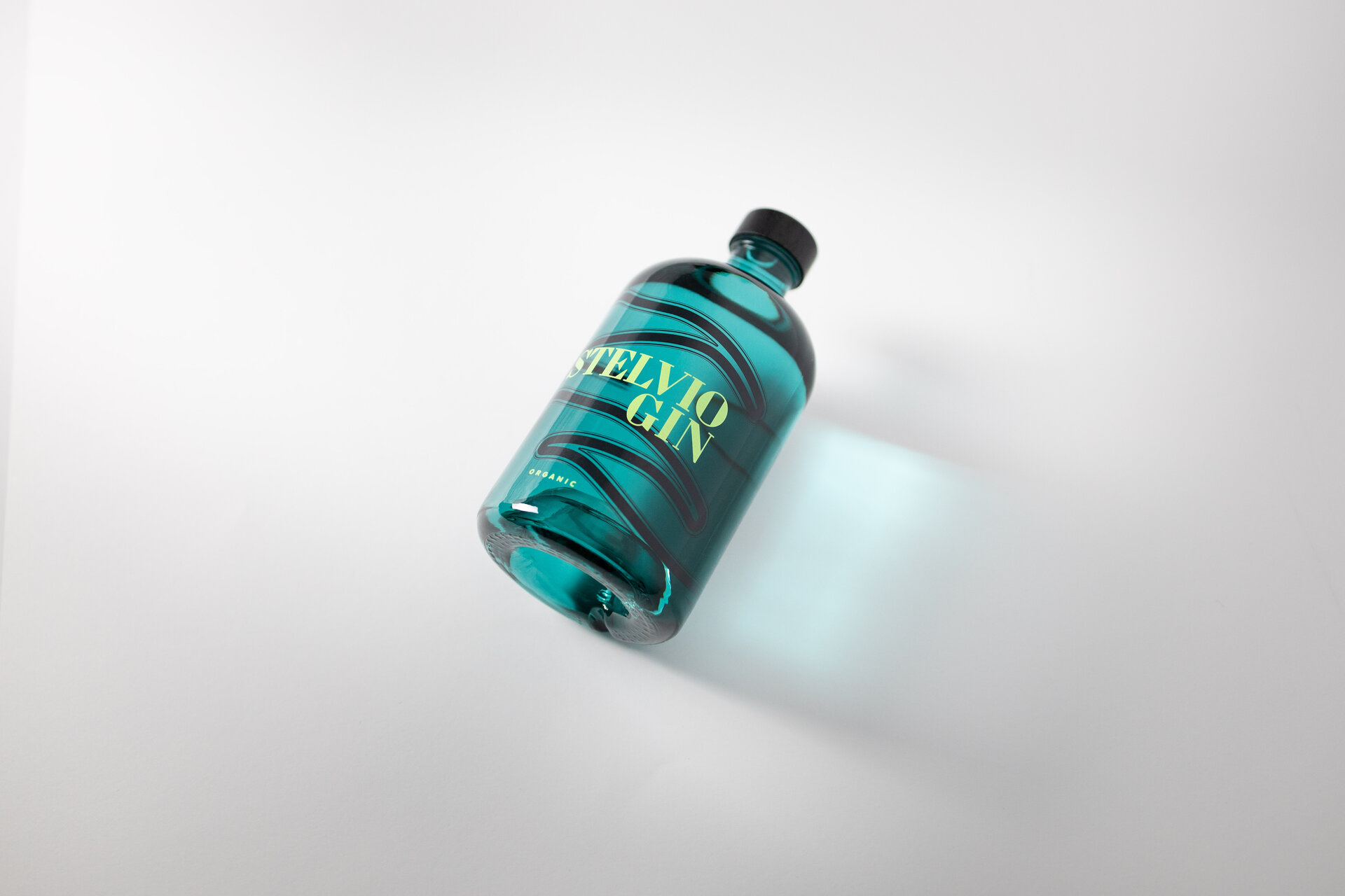
Stelvio Pass
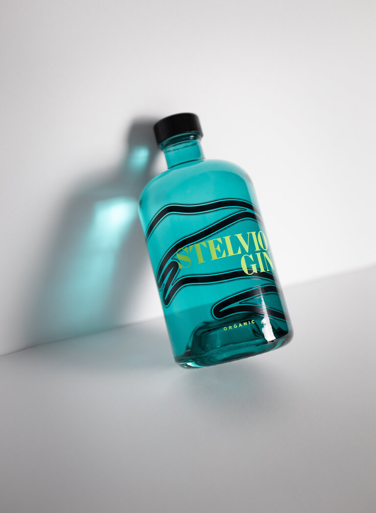
The resting shape of the glass bottle with its black wooden stopper pays tribute to the majestic beauty of the Stelvio Pass. The turquoise blue lacquer captures the shimmer of the glacier ice and the precise screen printing on the bottle stylises some of the most striking curves of the pass road with its 48 turns. The lines convey a sense of adventure and are reminiscent of the history of this technical masterpiece.
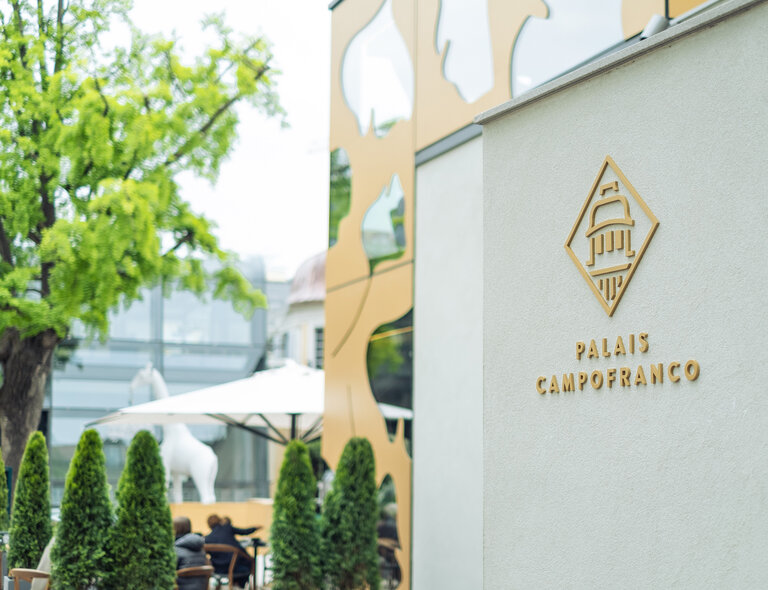
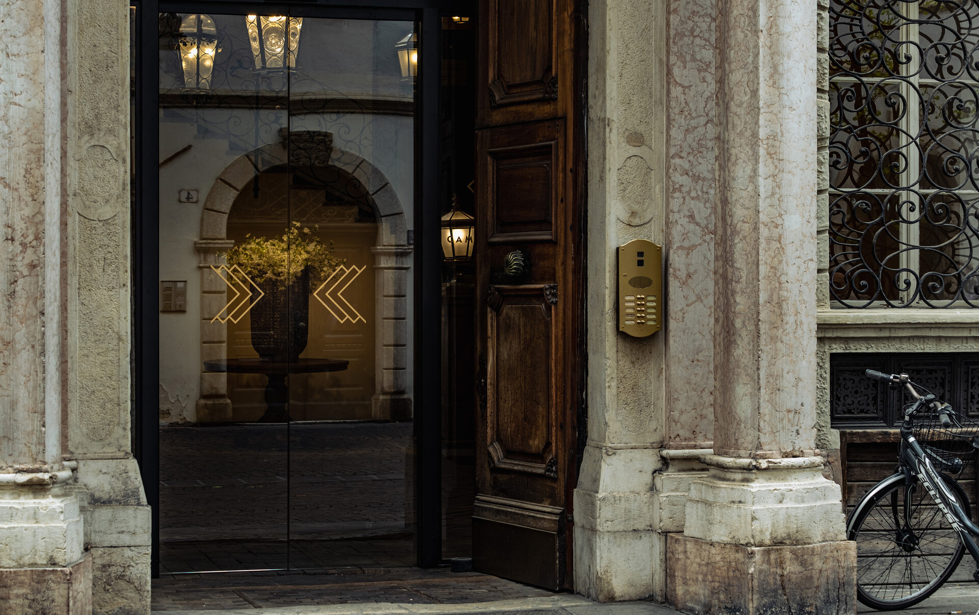
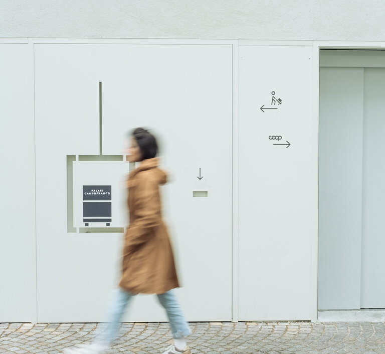
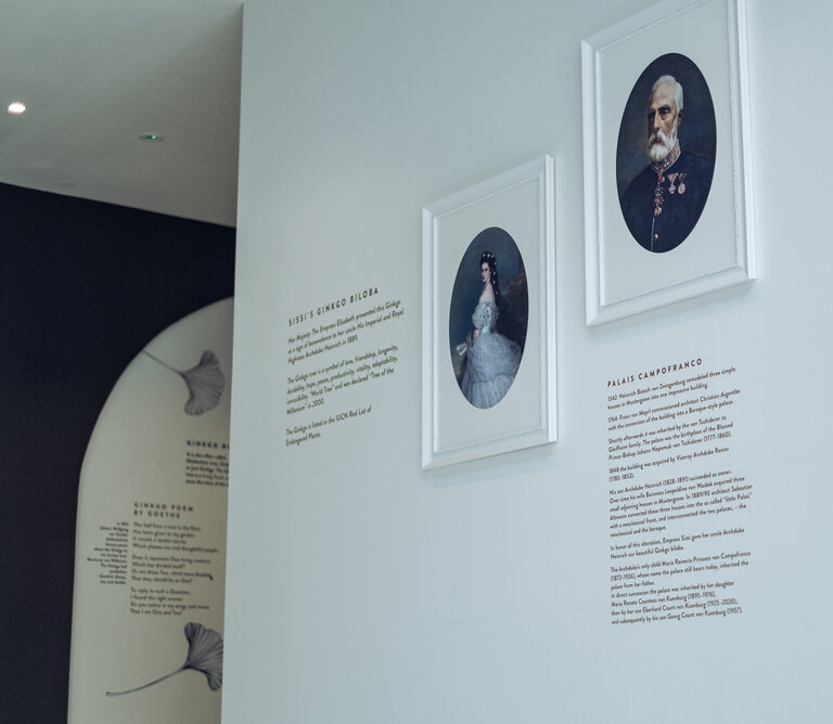
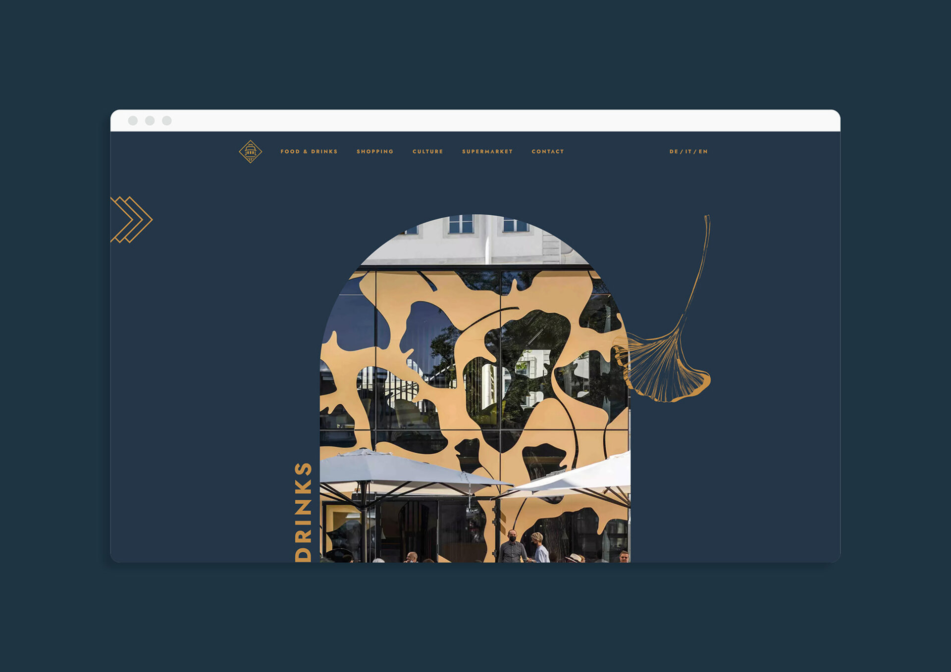
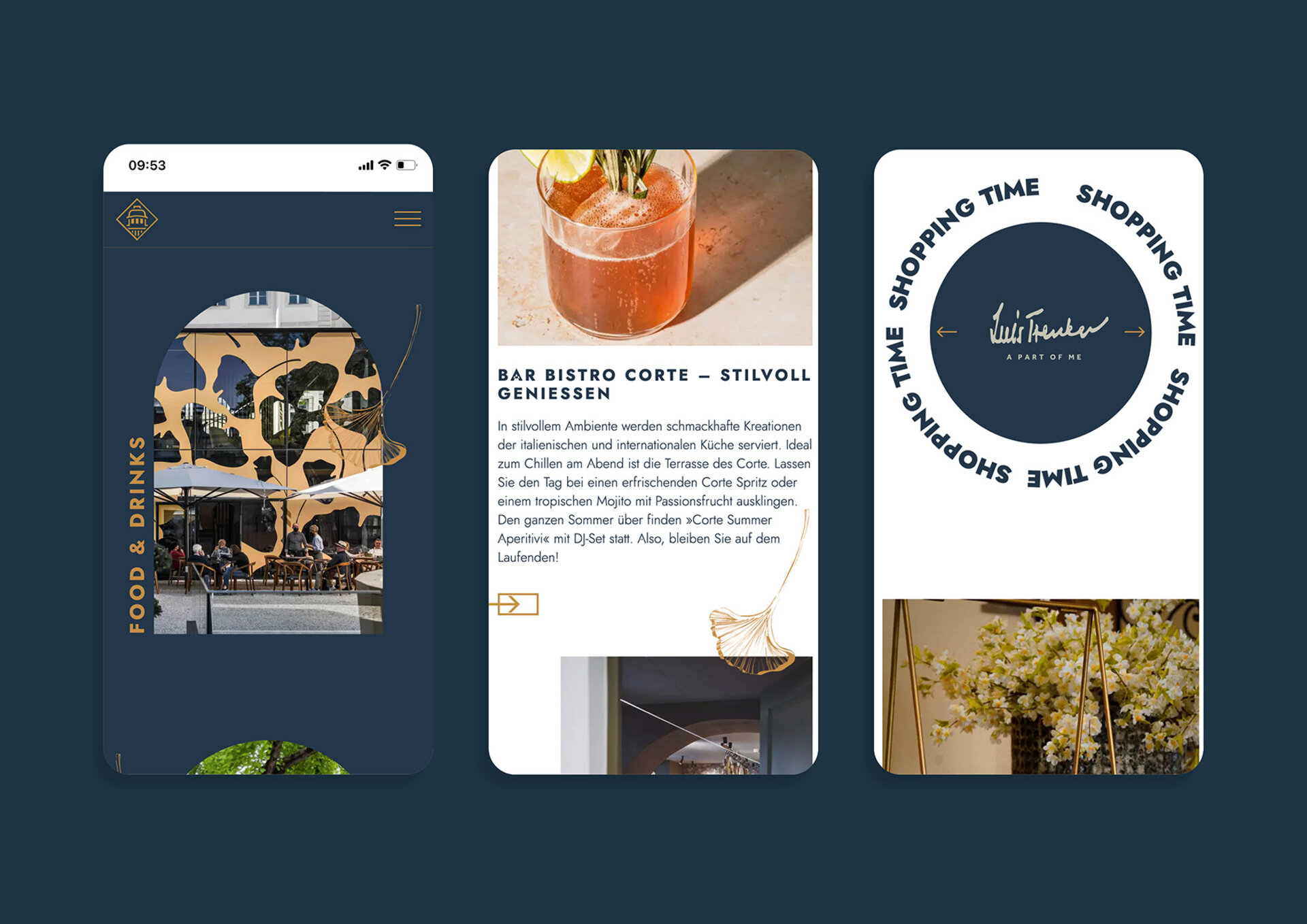
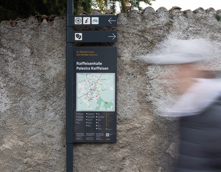
A new wind is blowing through Palais Campofranco in the heart of Bolzano. A place where history was written and which has now been filled with new life. Empress Sissi's gift is now enthroned in the inner courtyard in what is probably the world's largest flower pot: the Ginkgo Biloba, a natural monument of the city of Bolzano. This very tree is also the inspiration for the signage system in the extensive complex.
Our task was to design the signage system for the estate. It was important to us to incorporate the charm and elegance of Palais Campofranco into the design. The result is a wayfinding system with class! The elegant ginkgo leaves and the linear icons form an exciting symbiosis and harmonise with the architecture of the building. The corporate elements — derived from the logo brand — are also part of the website. Through the skilful combination of colours, icons and the floating ginkgo leaves, the design concept radiates lightness and elegance. We wonder if Empress Sissi would have liked it ;-)

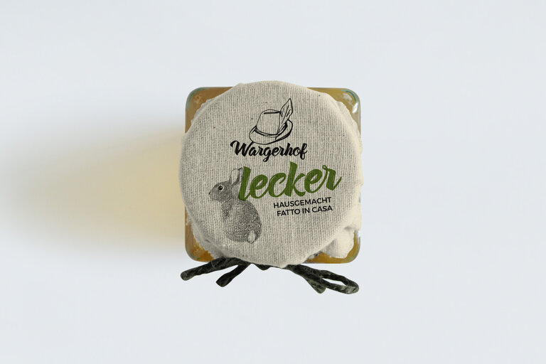
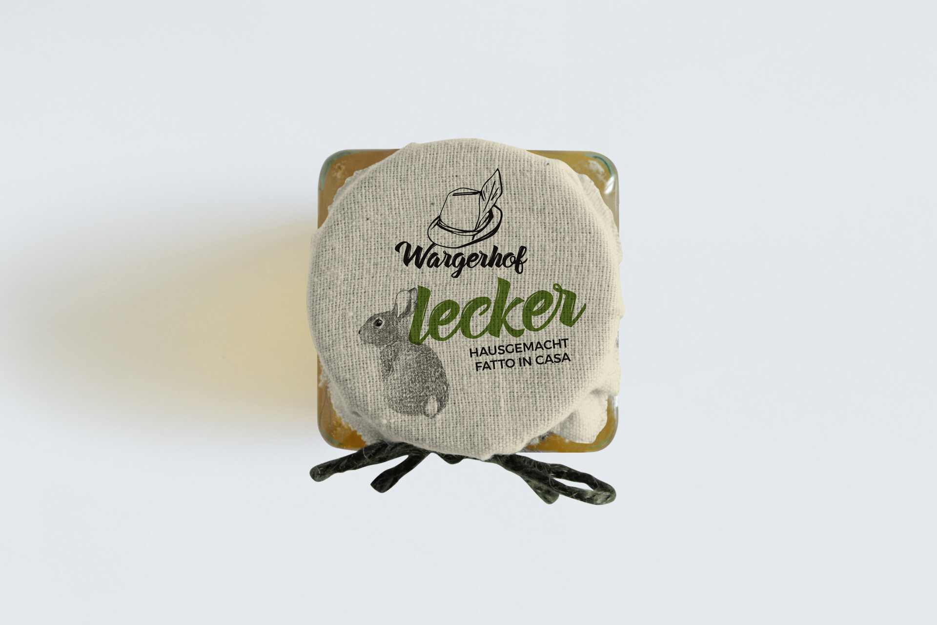
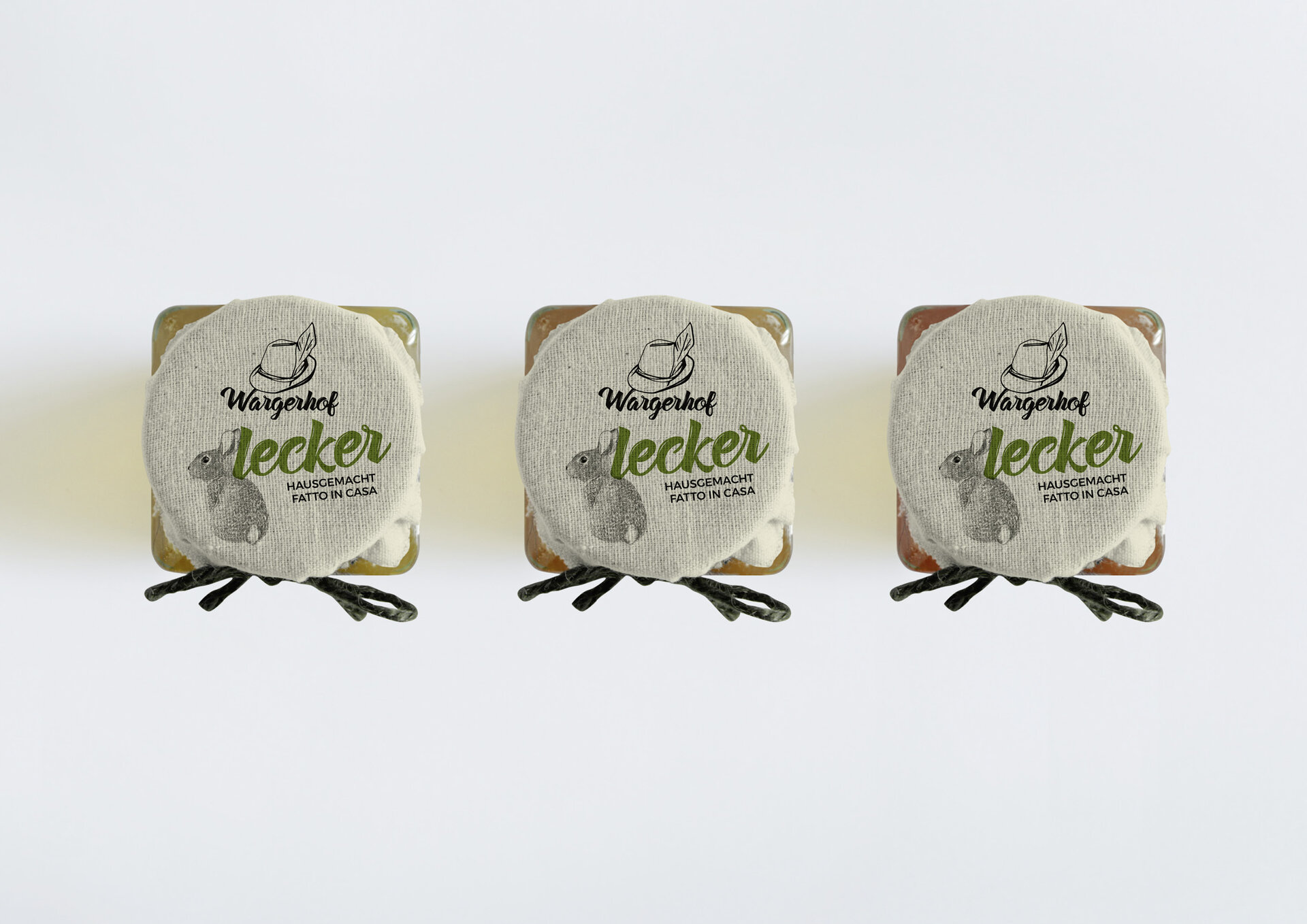
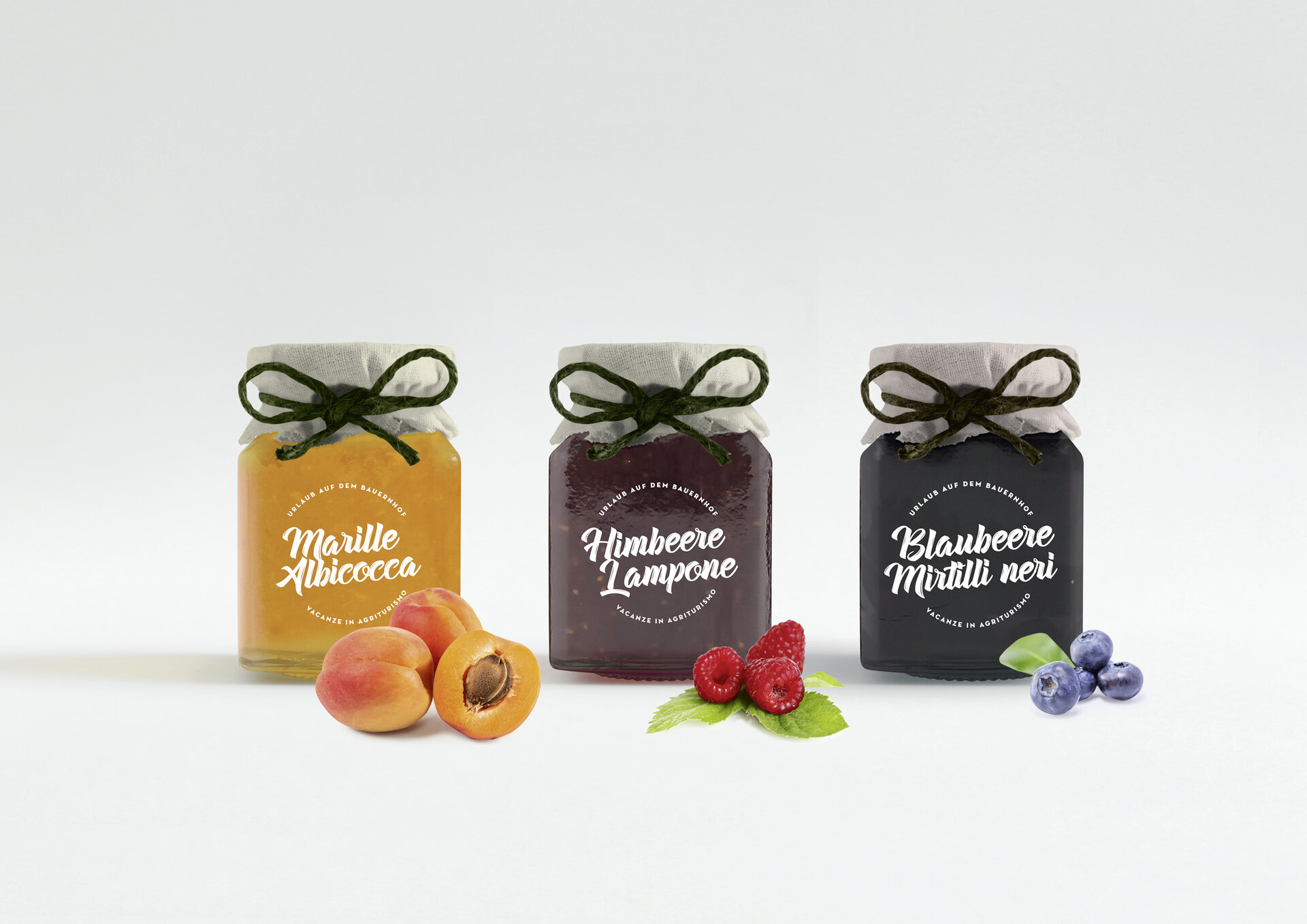
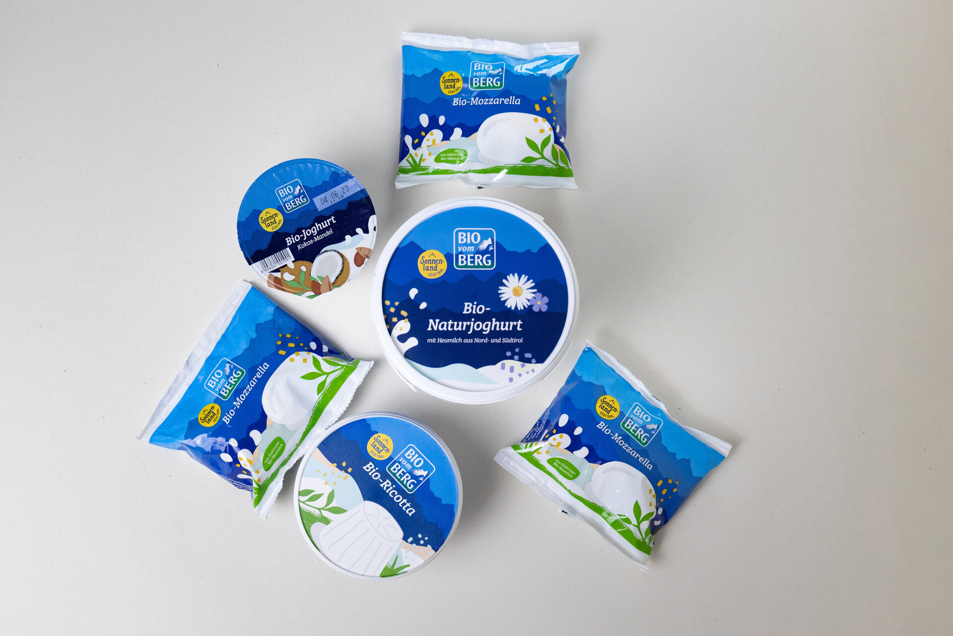
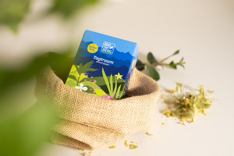
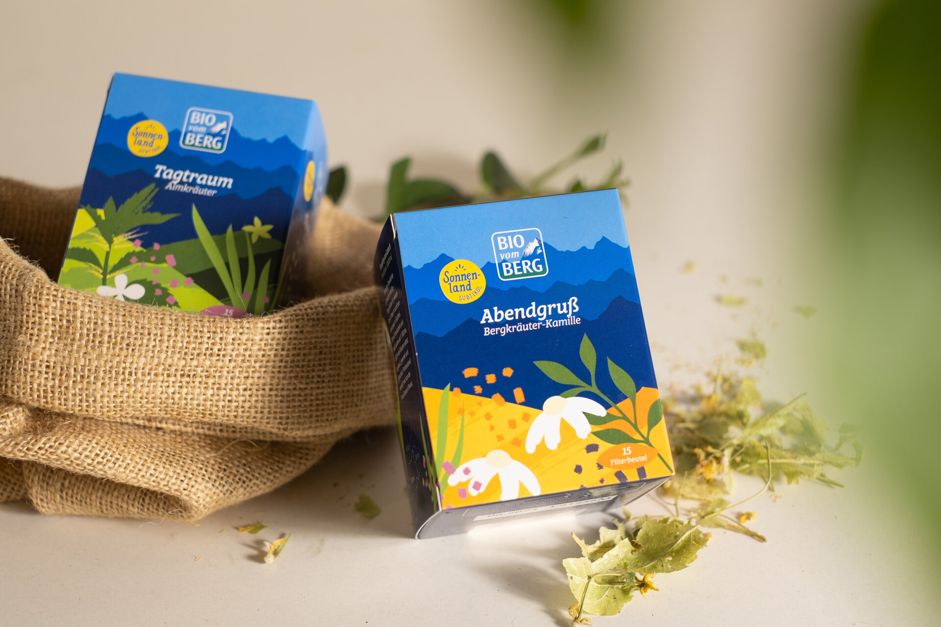
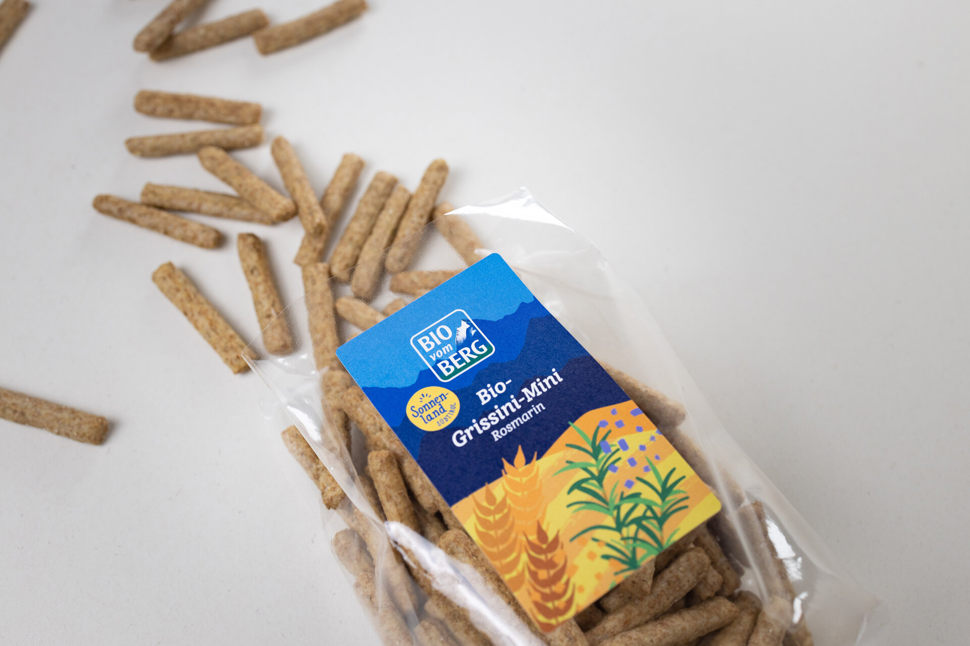
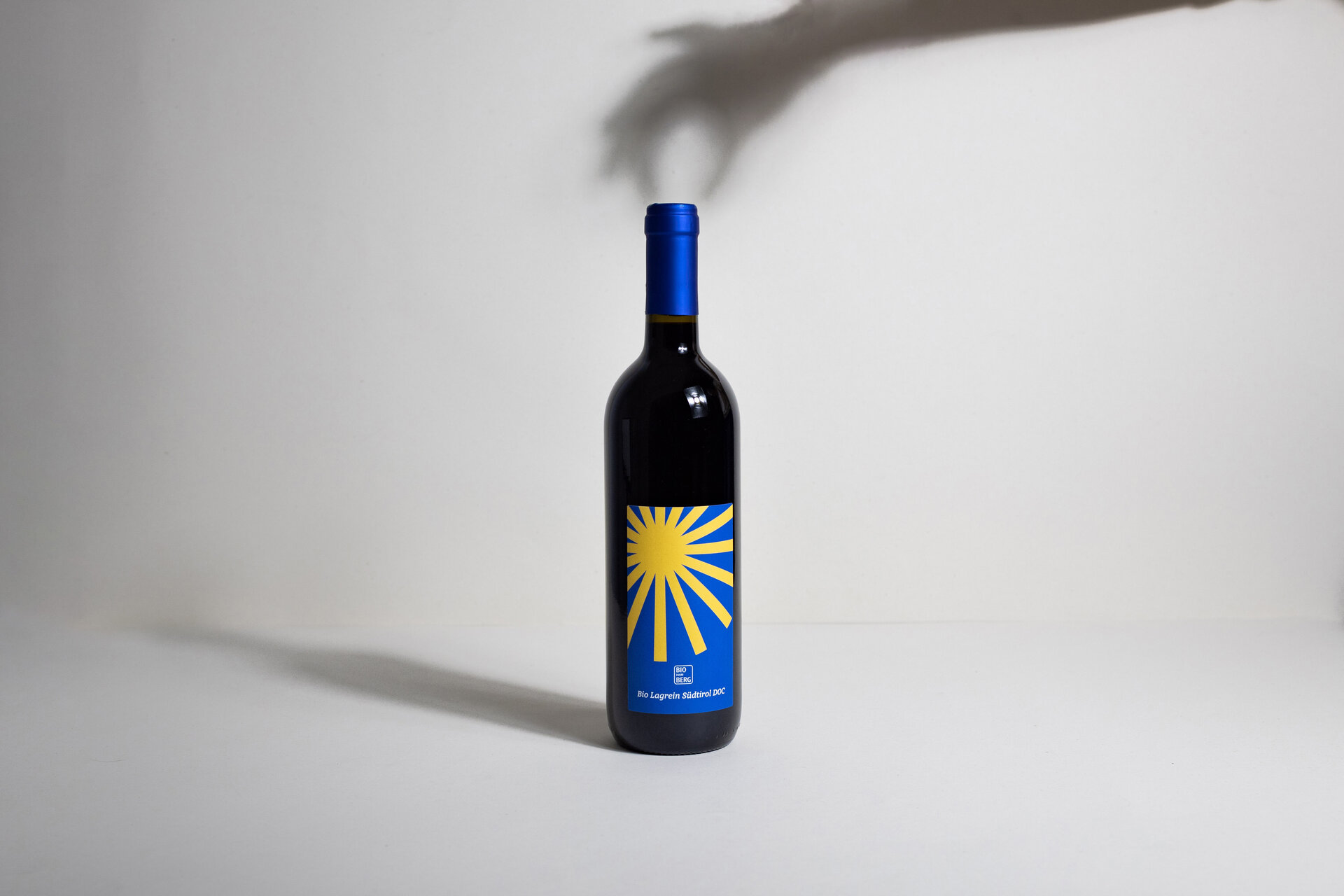
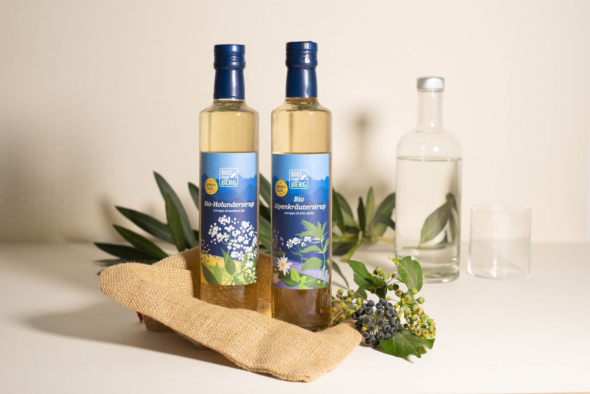
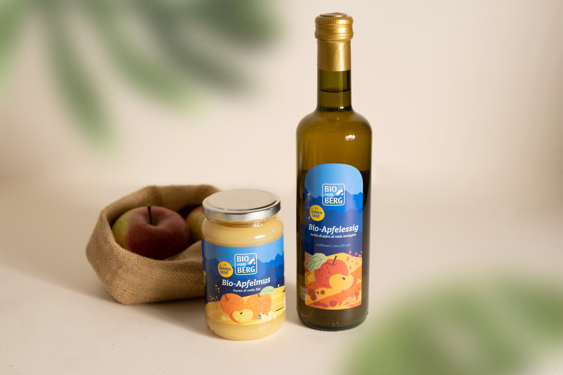
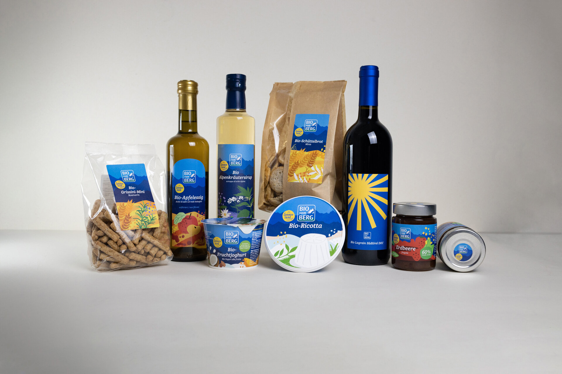
A project in the field of packaging design, which we were able to realise with great enthusiasm for the Tyrolean cooperative BIO vom BERG. The task: to create a sub-brand with a naming and design concept for South Tyrolean organic products.
With the aim of reflecting the artisanal, cheerful character of South Tyrolean organic food, a concept was developed that can be applied to all product categories.
The interplay of relaxed illustrations and a bright mix of colours creates an appealing and high-quality overall impression. The special feature: each product features customised illustrations to match its content. At the same time, the brand character is easily recognisable thanks to consistent basic elements. The "Sonnenland Südtirol" packaging is an eye-catcher on the shelf. They create a strong identity and have a high recognition value.

Our design team loves challenging projects and sets trends with smart design and crystal-clear strategy.
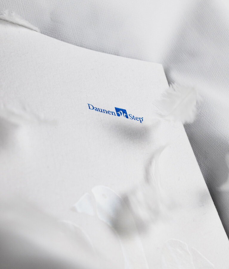
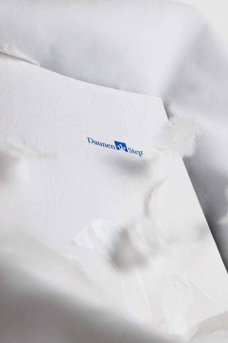
DaunenStep has been a quality player in the duvet industry for over 120 years. The internationally successful company focuses on tradition and innovation.
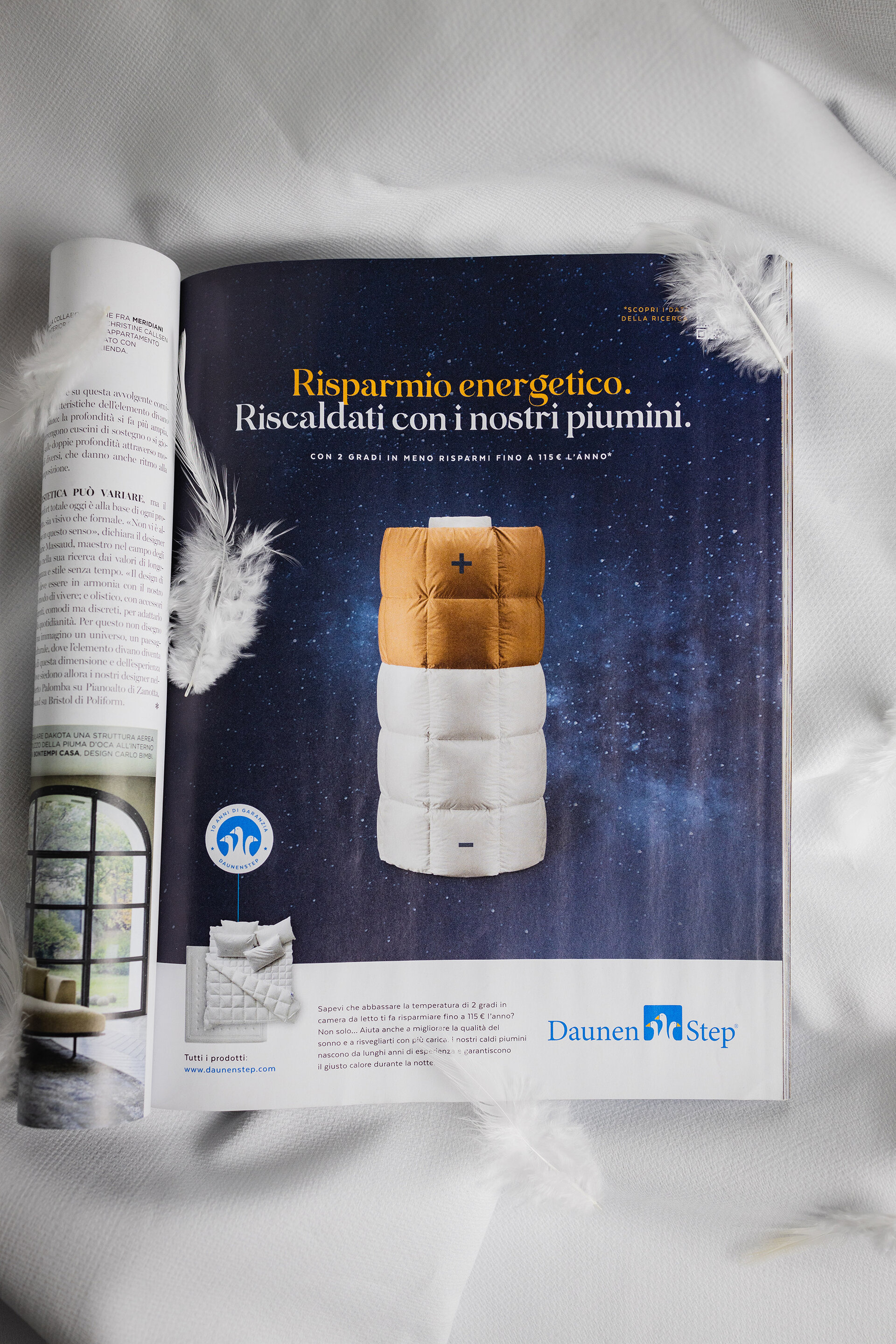
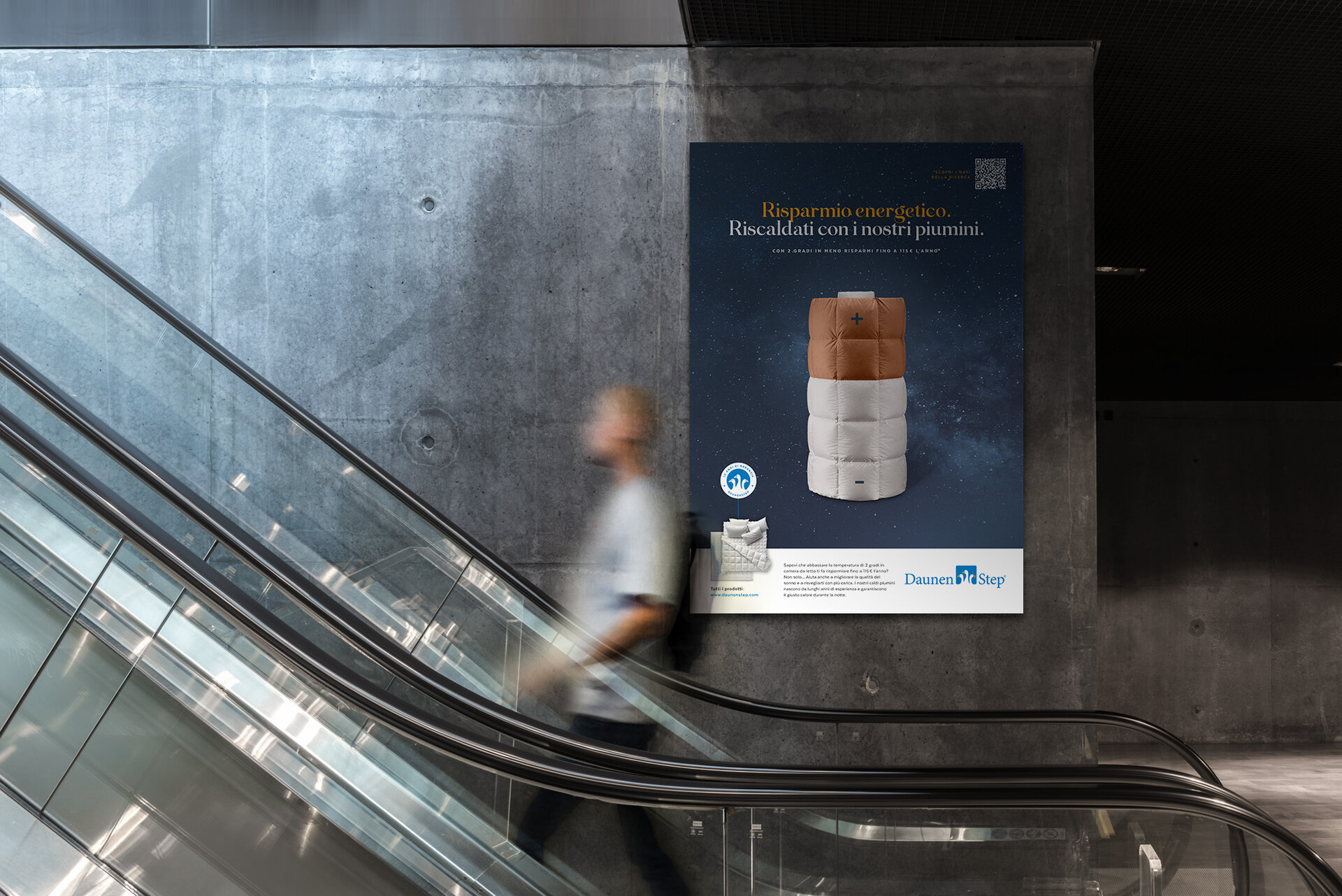
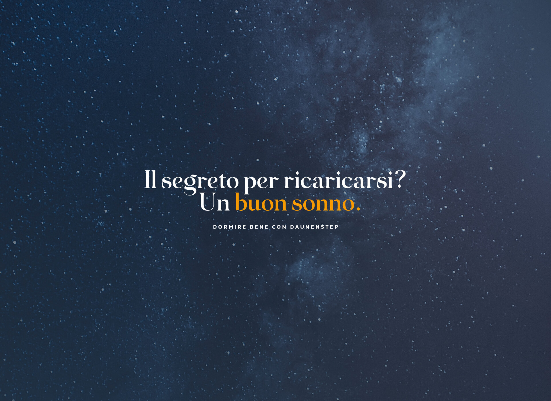
Our first step in creating this advertising campaign was to analyse the target group and their needs. Conserving resources and rising energy costs are topical issues. The created advertising campaign shows a possible solution for current problems: The high-quality down duvets from DaunenStep make it possible to lower the room temperature and thus save resources and costs. This statement in the advertising campaign is backed up by figures from a new study.
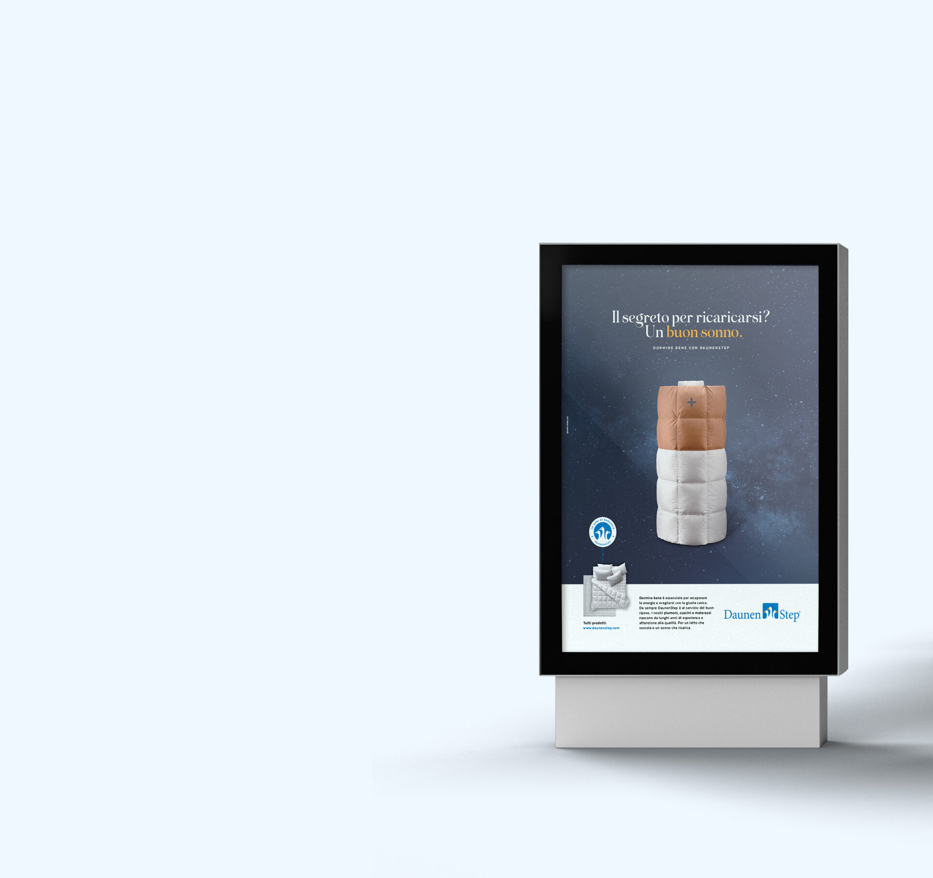
The visual of the campaign is a battery in the form of a down duvet. The down blanket battery symbolises the warming energy. The harmonious midnight blue sky in the background stands for restful sleep and emphasises the message of the DaunenStep brand: to enable people to enjoy a restful night's sleep.
The campaign objective was achieved with a problem-solving strategy and a visually appealing campaign that positively catches the viewer's eye and stimulates thought.
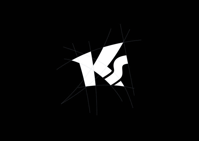
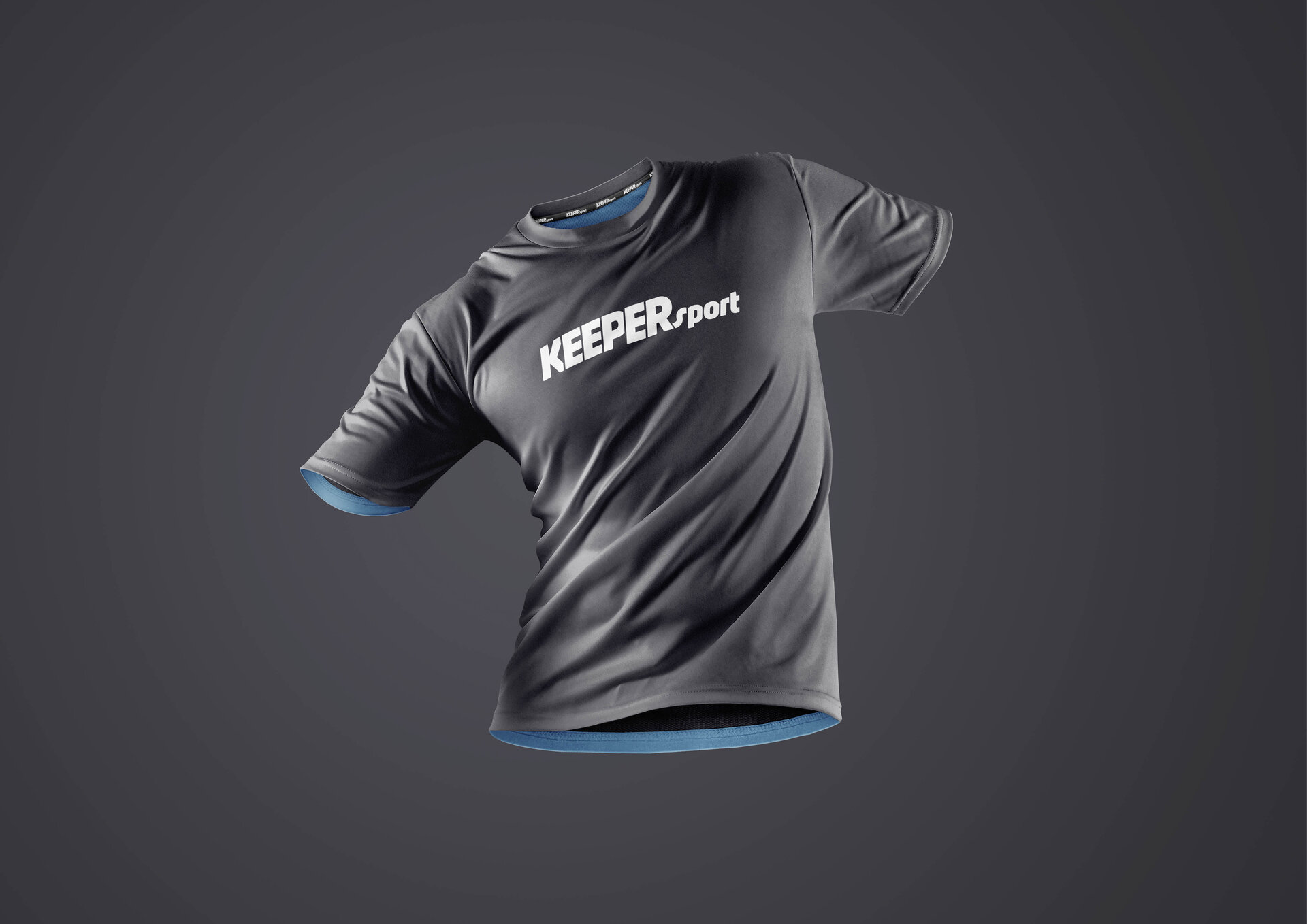
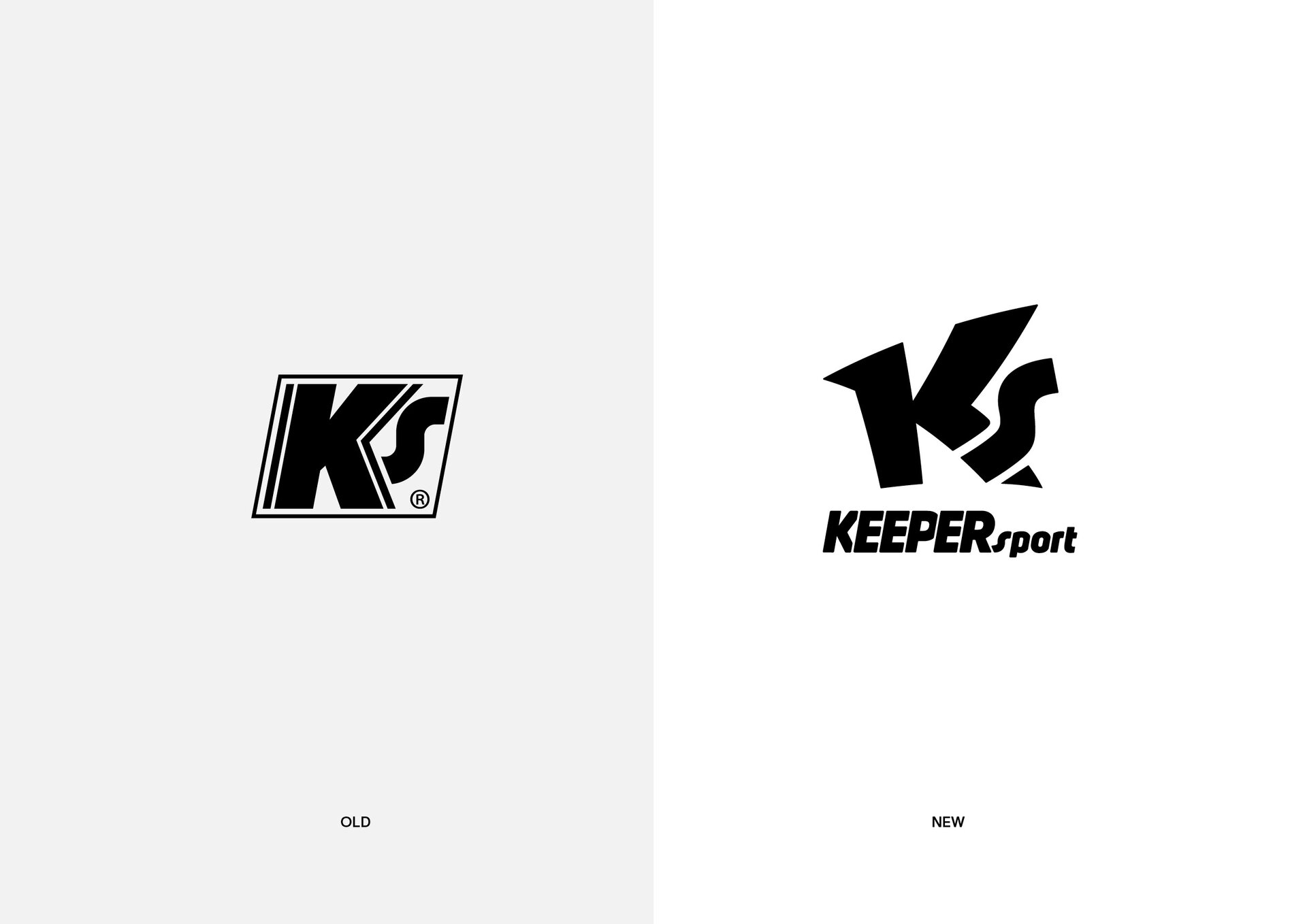
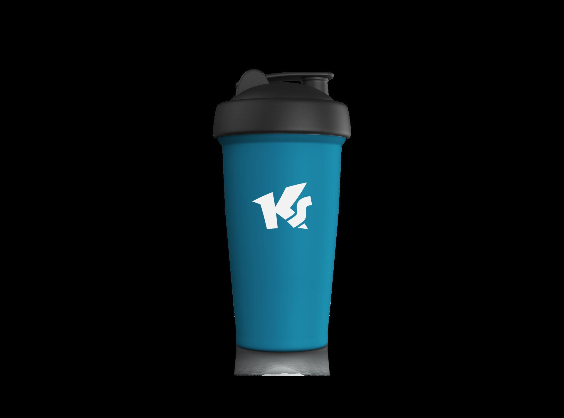
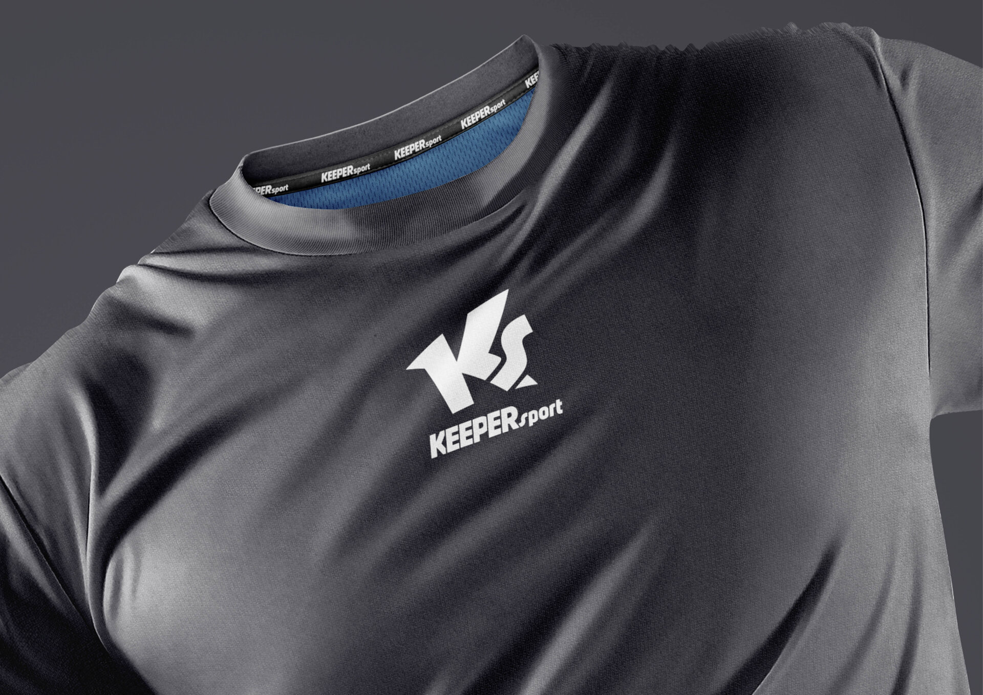
KEEPERsport is an internationally successful producer of goalkeeper clothing. Headquartered in Vienna, KS has been producing high-quality equipment for top international goalkeepers for over 20 years. The company anniversary of KEEPERsport was an incentive to renew the brand logo. The focus was on the monogram, with the aim of developing a dynamic logo that is ideal for branding on sports textiles. The Facelift logo conveys sportiness and guarantees recognisability. The construction of the logo consists of curved lines and pointed edges; these convey a feeling of movement and precision without losing stability.
The logo icon fulfils its function even on very small surfaces. The word mark was also given a facelift to match the monogram.

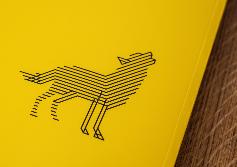
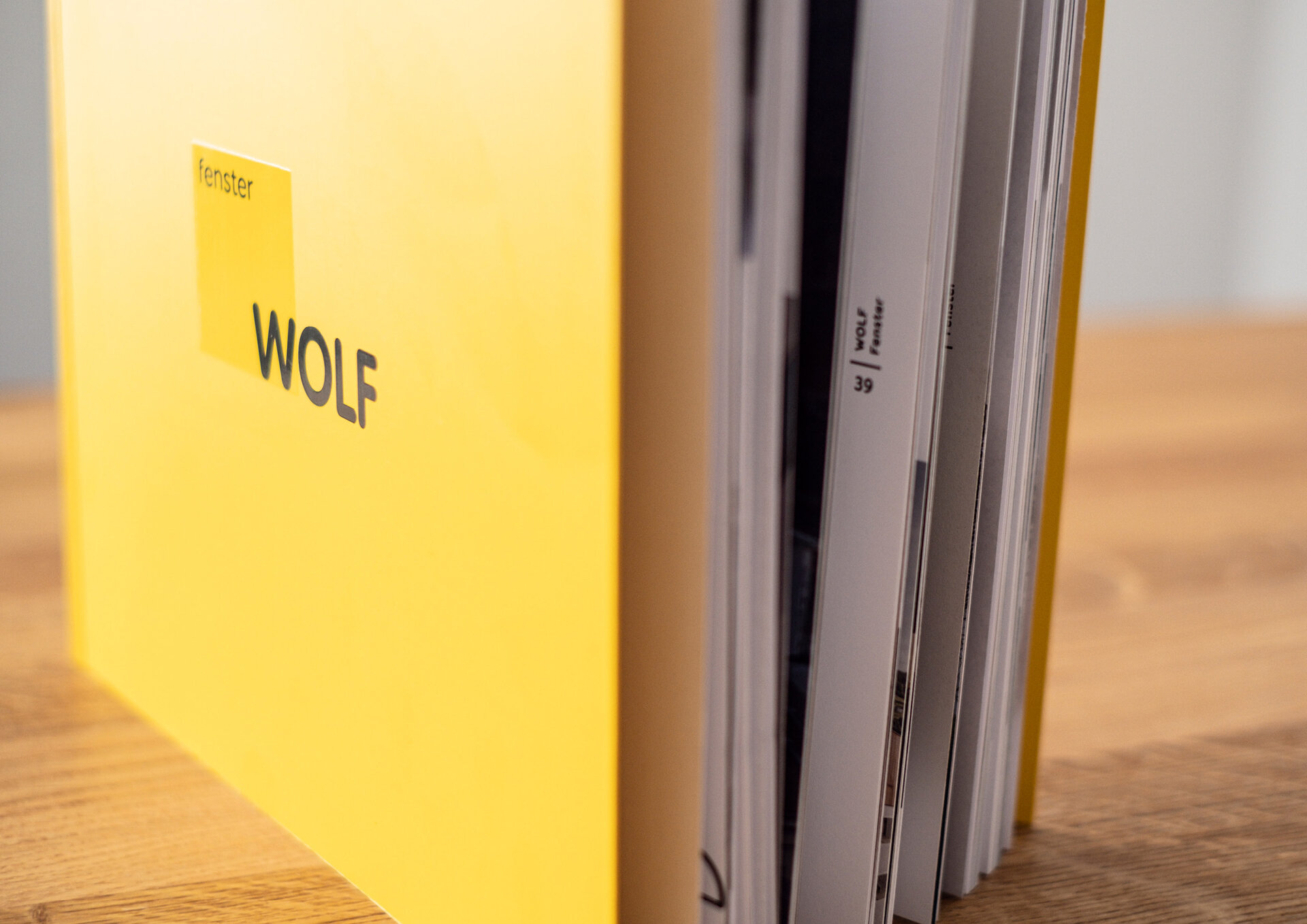
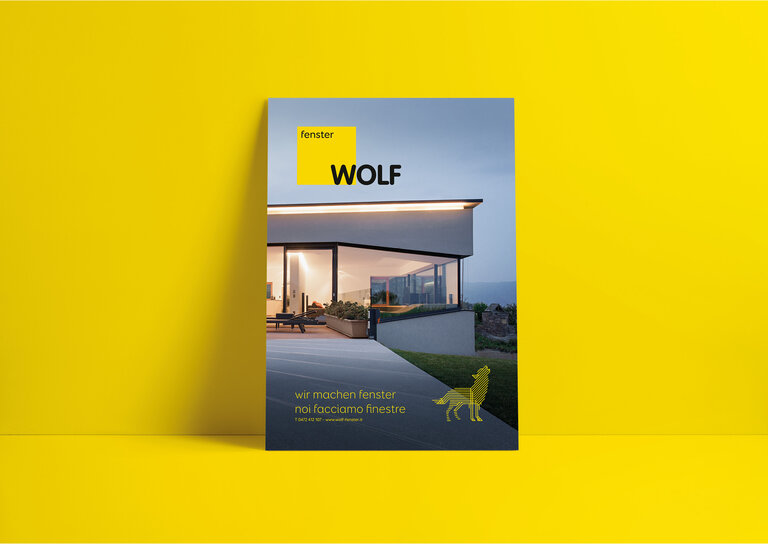
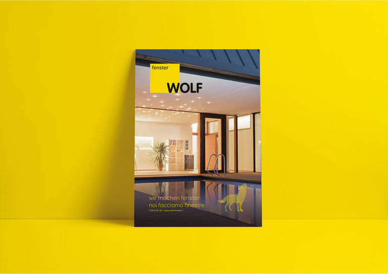
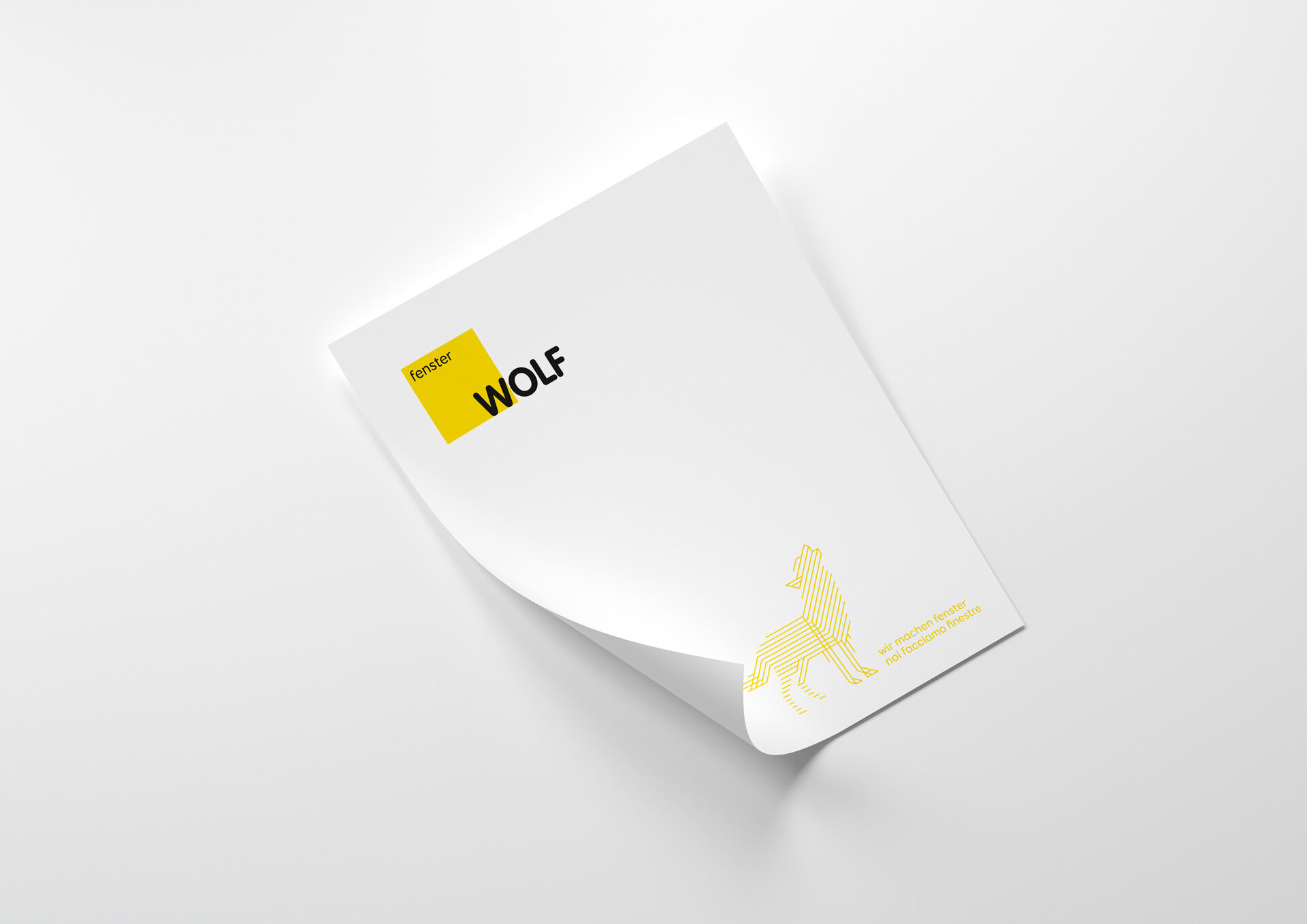
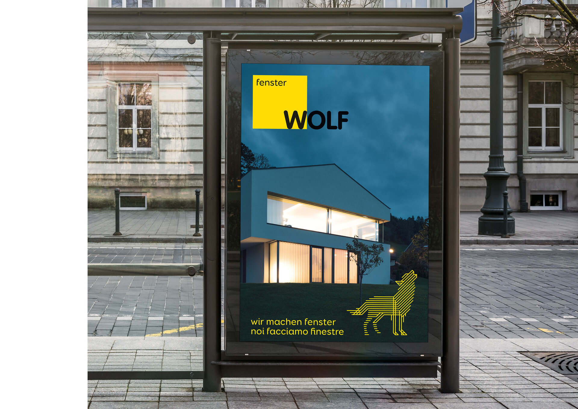
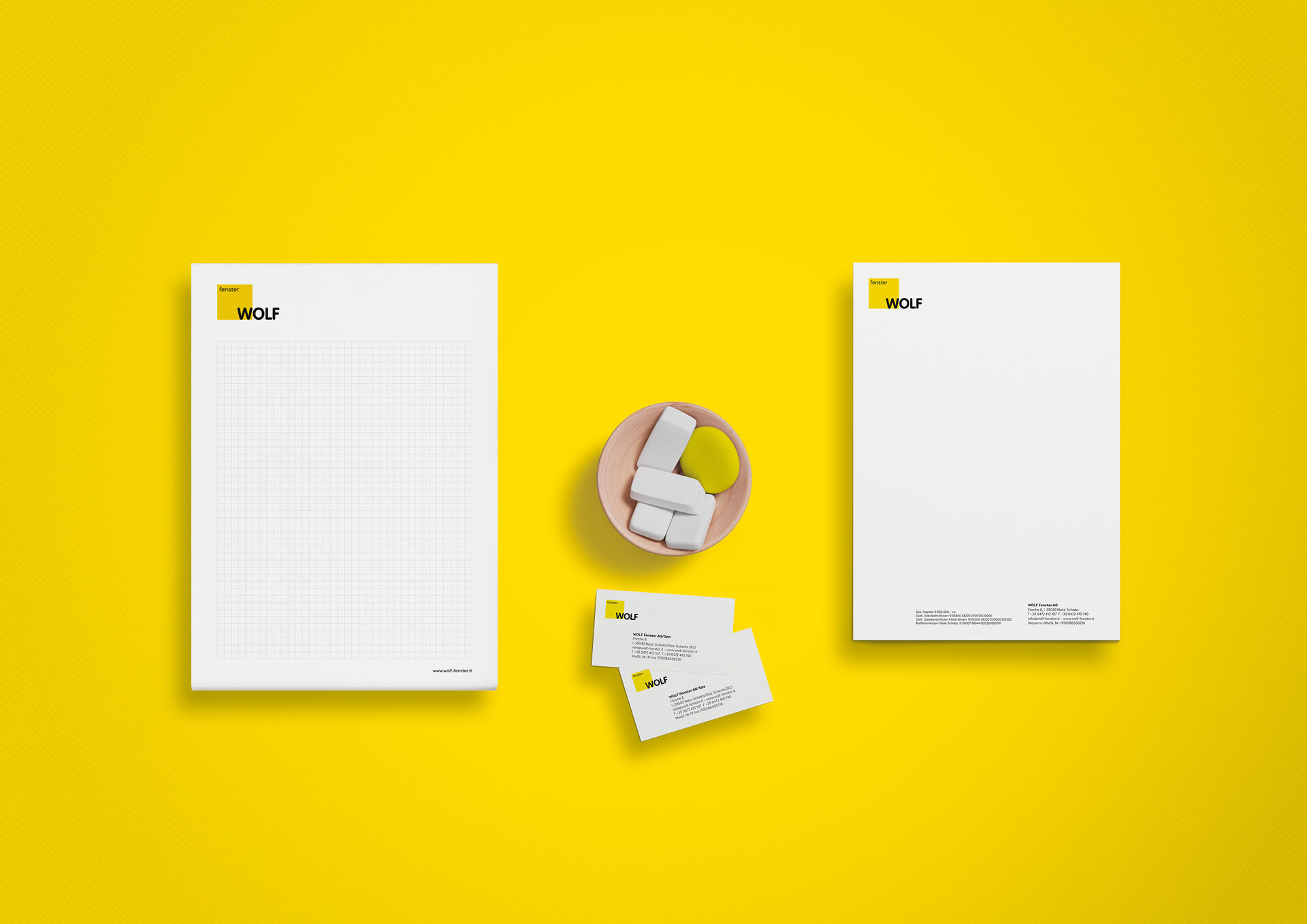
Wolf Fenster is one of the best-known window manufacturers in the region. Wolf creates first-class windows, sliding doors and façades with care, attention to detail and according to all the rules of craftsmanship.
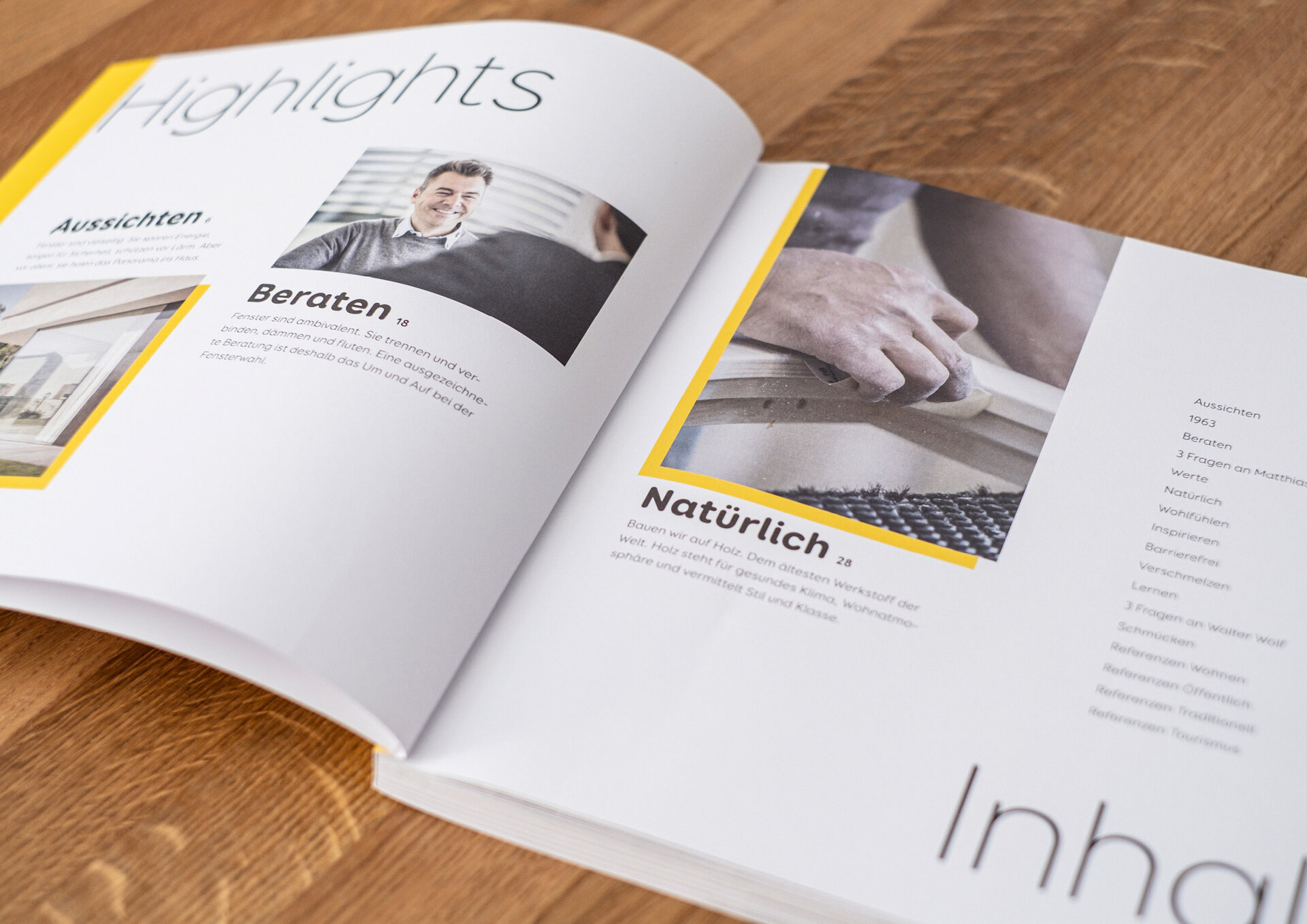
The logo underwent a subtle facelift. This was followed by advertisements, city lights, technical catalogues and the extensive product and sales catalogue. The latter serves to explain the innovative solutions and modern production methods of Wolf Fenster. The corporate colour yellow runs through the entire communication as a highlight colour and harmonises with the images, which are kept in cool tones and muted colours. The font concept consists of a "rounded" font — derived from the logo design — which has a friendly effect and guarantees high legibility. The look and feel of the catalogue allows readers to delve deeper into the world of Wolf windows.
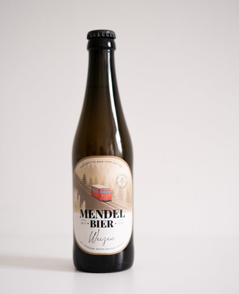
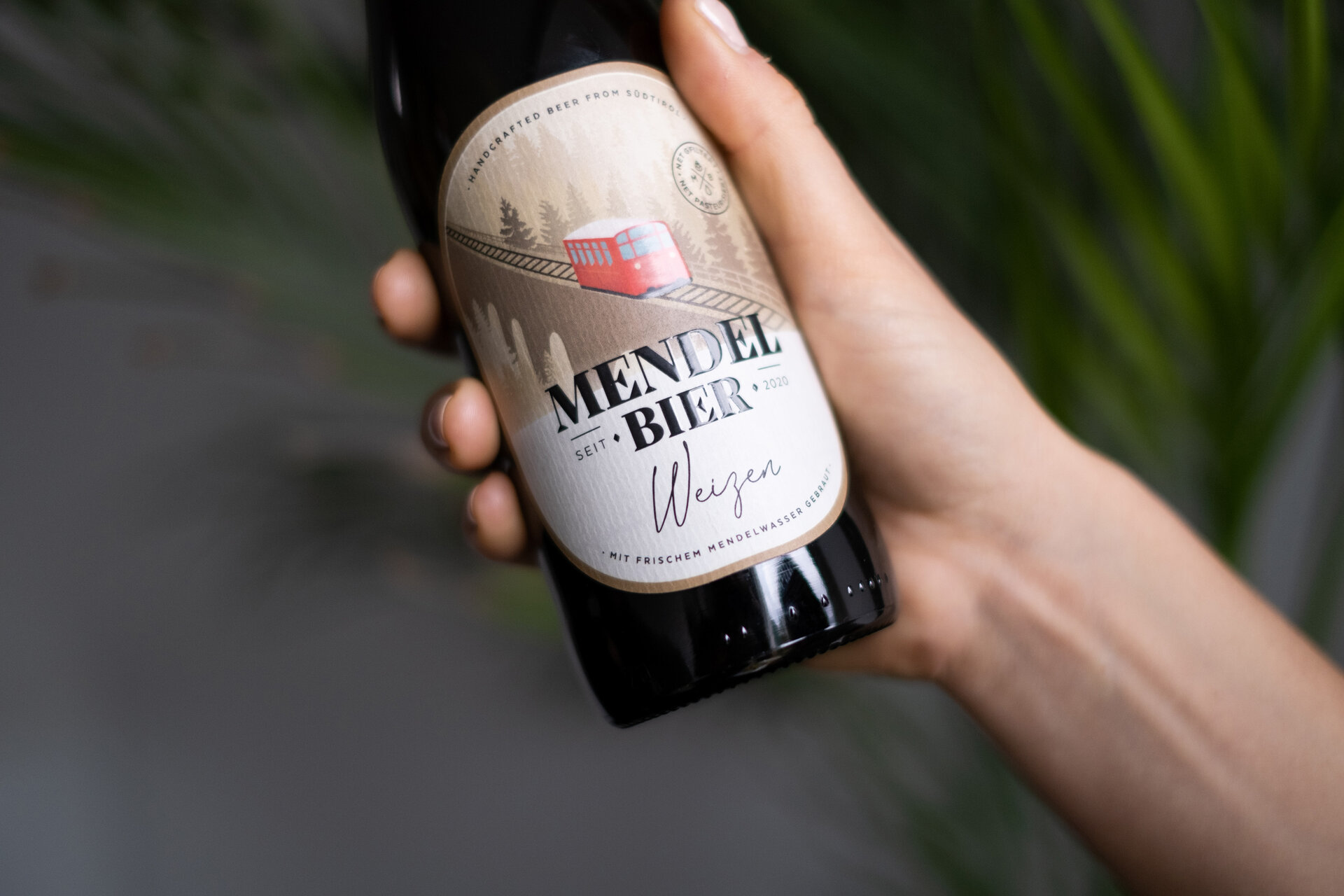
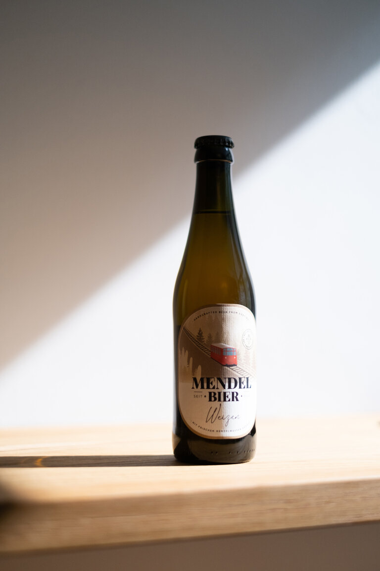
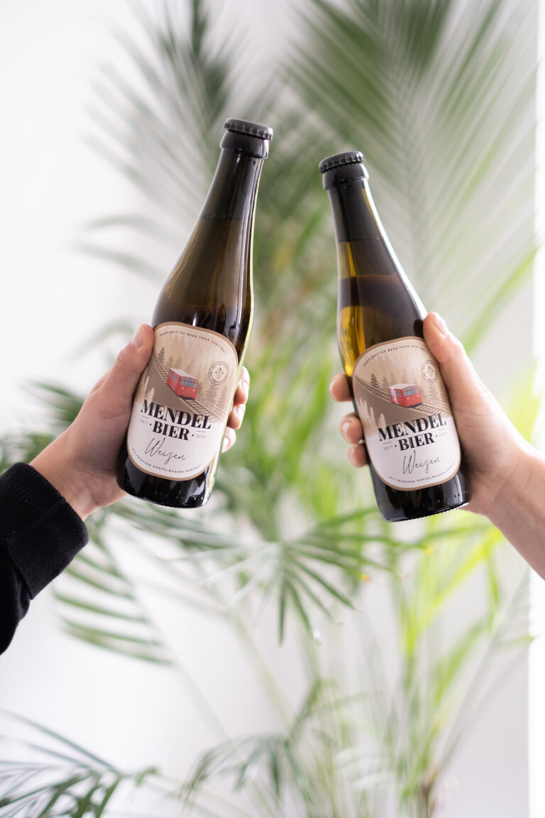
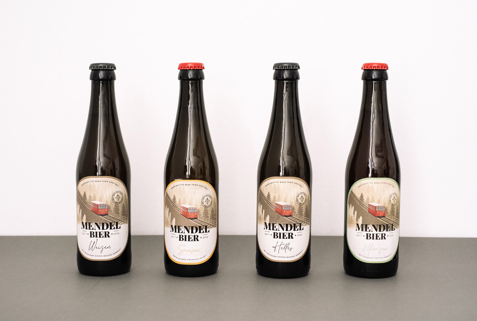
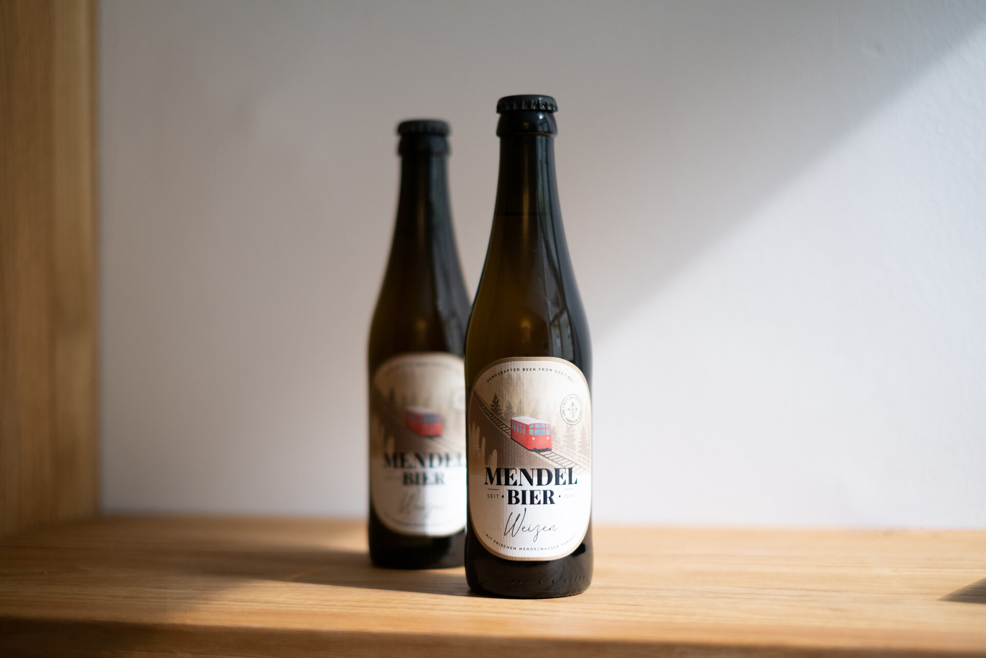
Mendelbier has been brewed by hand in Caldaro since 2020. We developed the logo design and packaging design for the young brewery, which reflects the character of the beer: The illustration of the Mendel railway in soft brown tones emphasises the South Tyrolean origins. The modern typography and the relaxed wording give the beer its young and fresh touch. Attention to the smallest detail: we chose a natural paper for the labels, and to emphasise the logo there is a glossy varnish finish. The Mendelbier range now consists of four different varieties. And the family is growing ... Cheers!
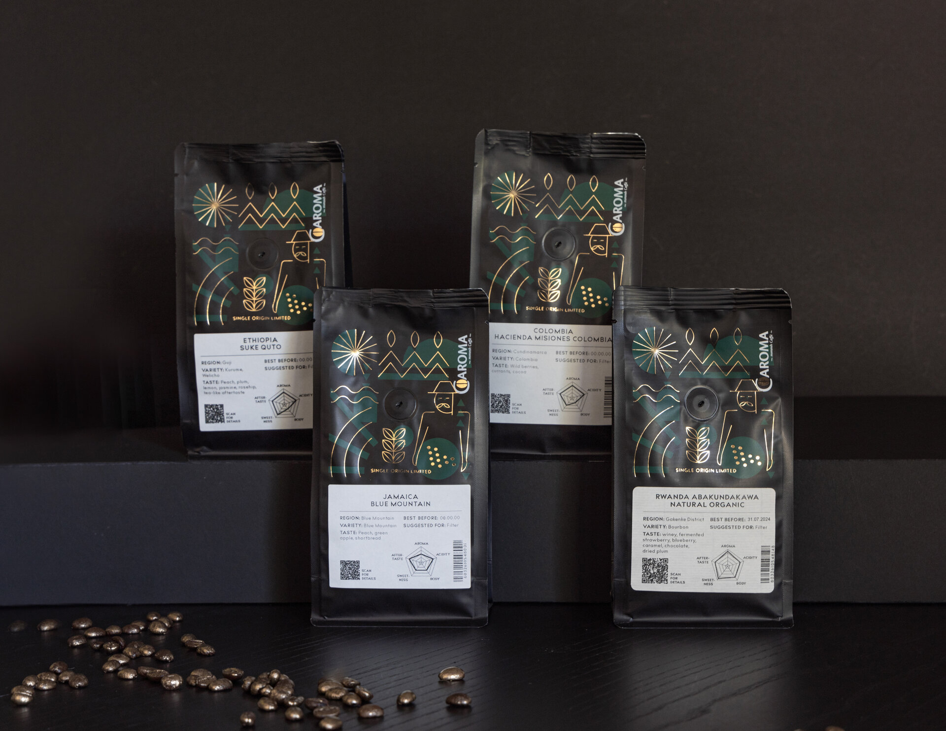
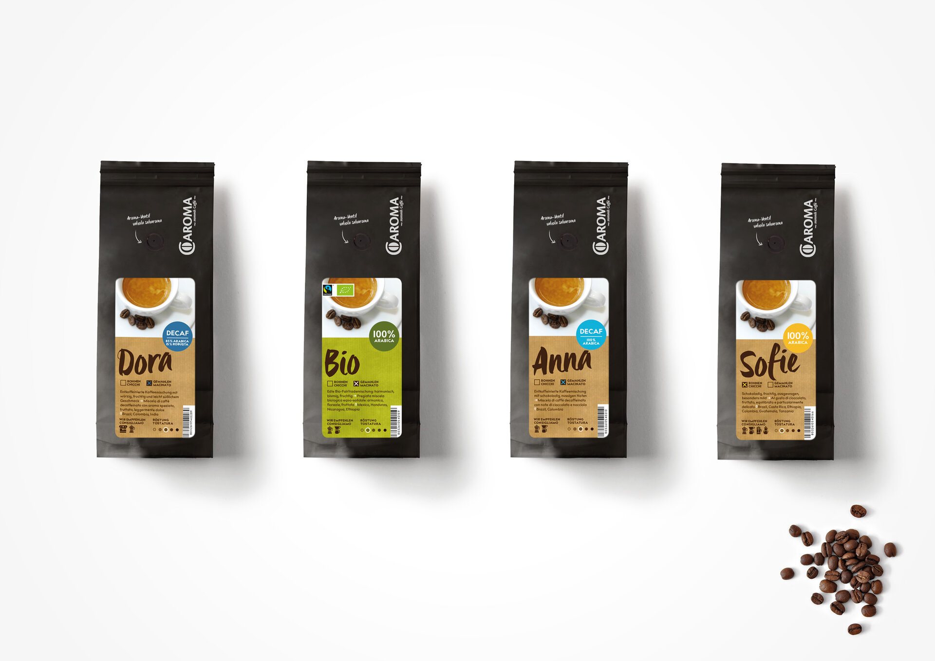
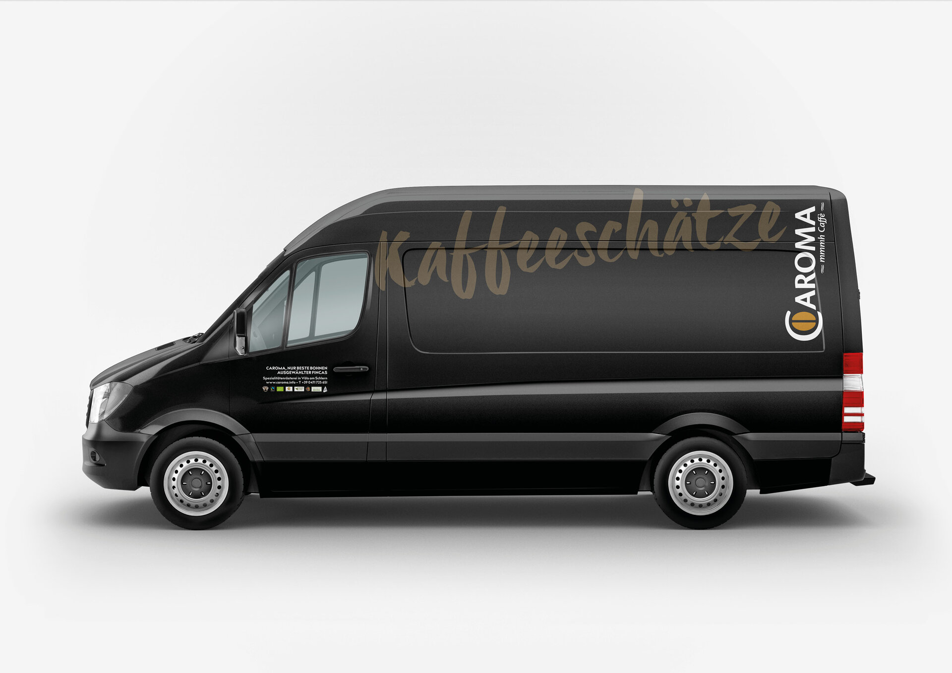
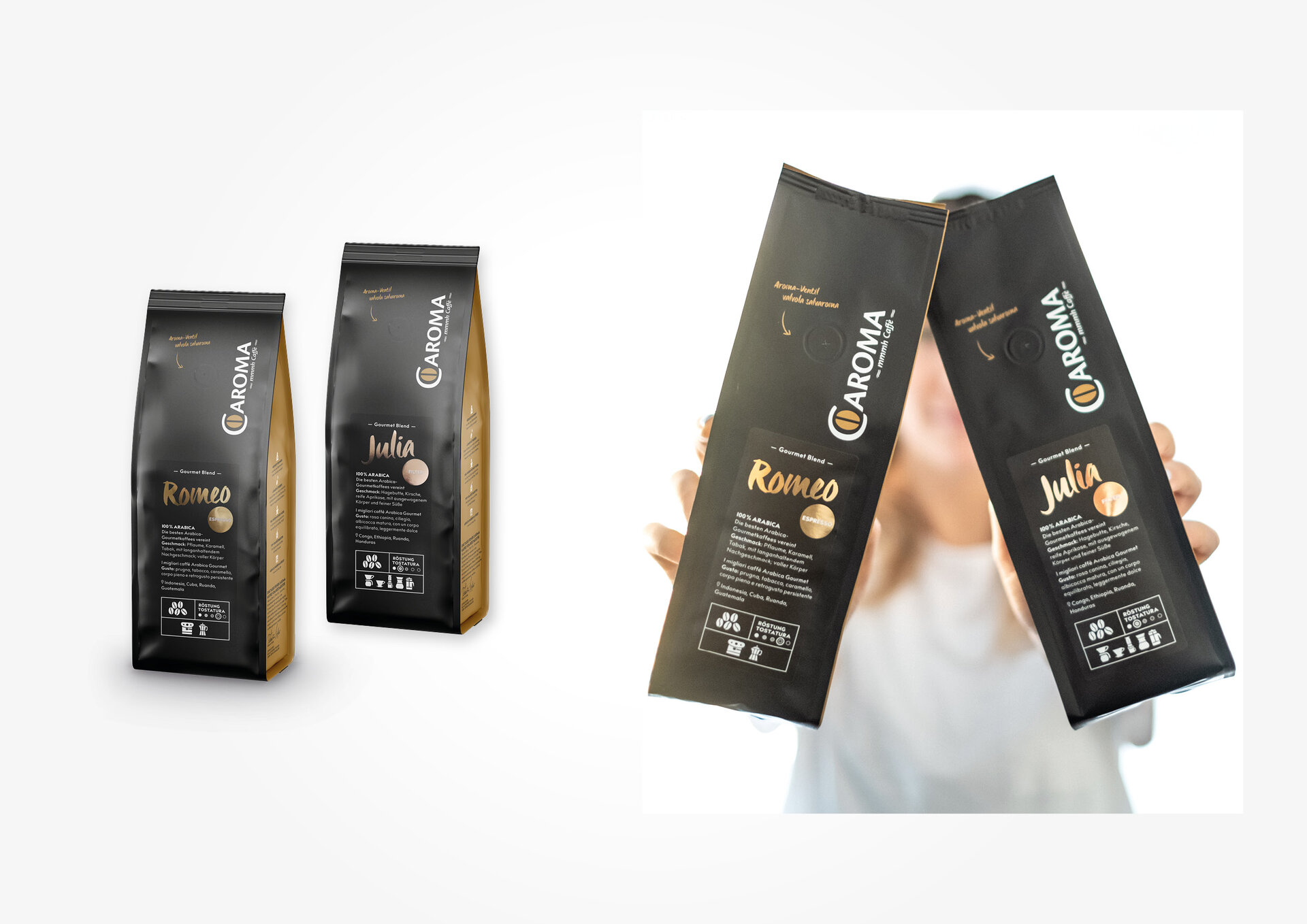
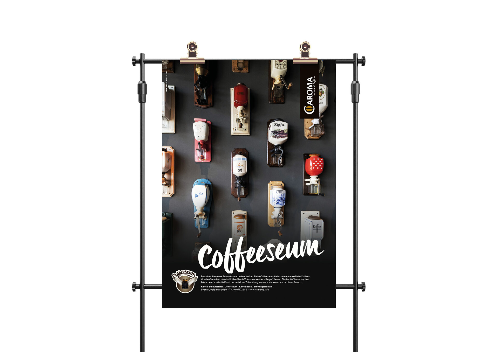
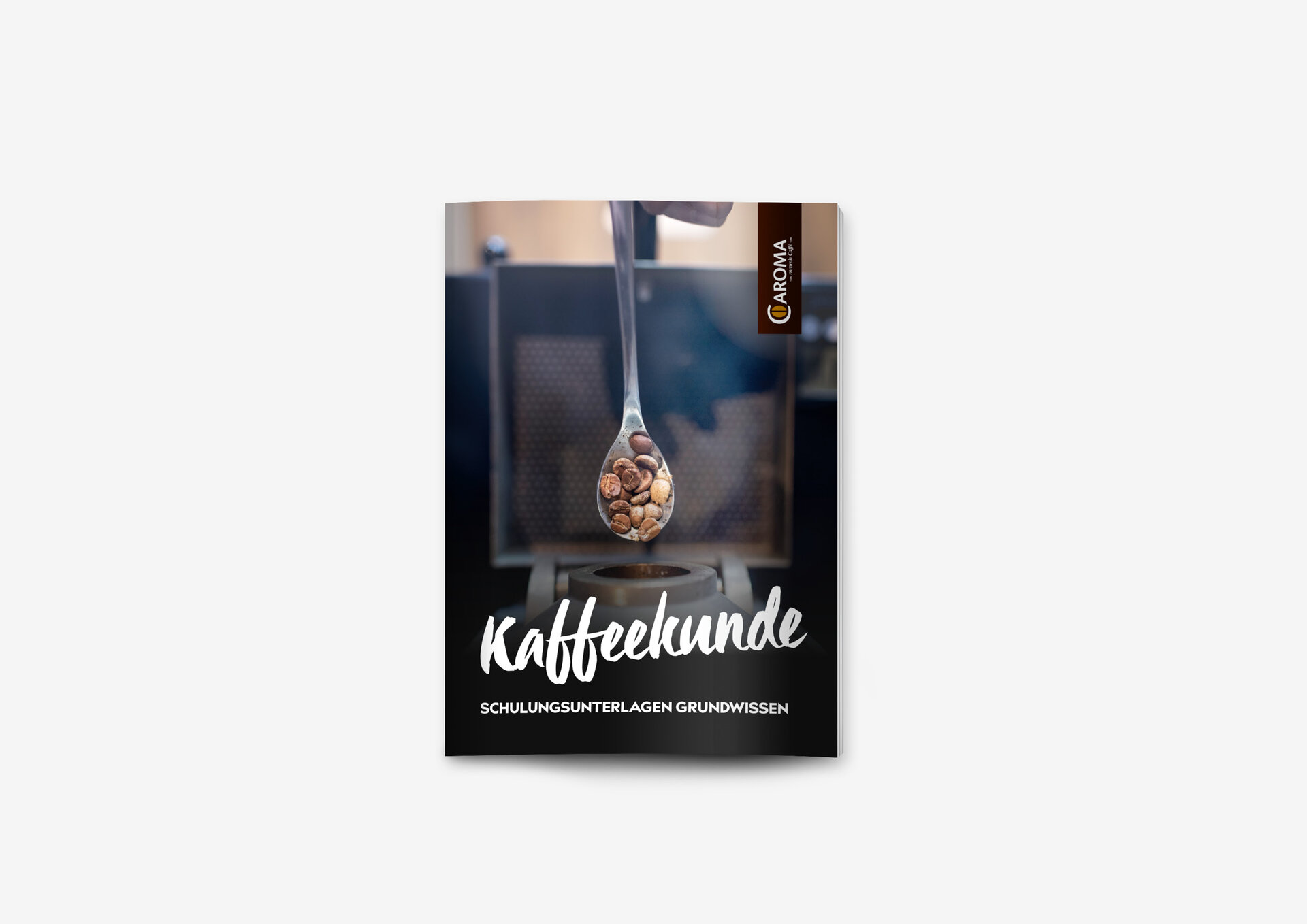
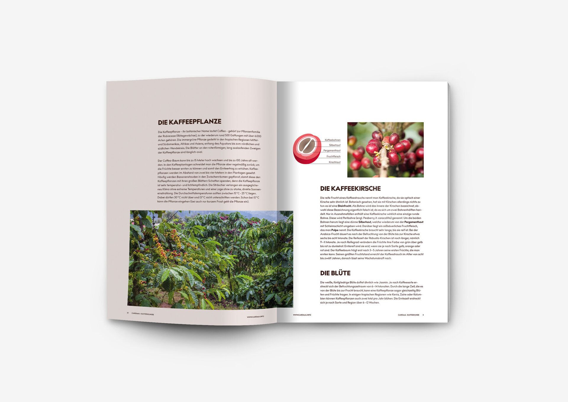
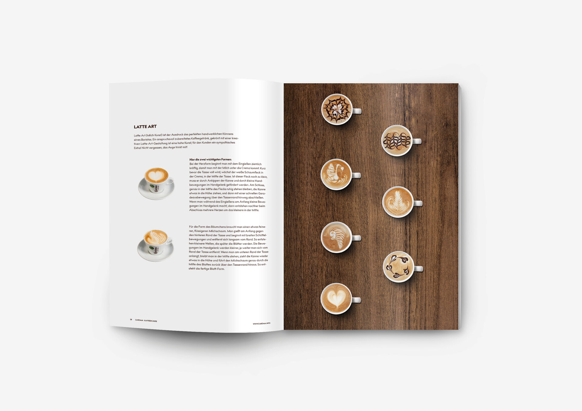
It all started with Valentin Hofer's passion for exceptional coffee. And decades later, this passion still takes centre stage: exceptionally good coffee. This passion for the world of coffee is what drives Brand Gorillas to create exceptional branding. The world of coffee is tangible at all brand touchpoints: Coffee shop, Coffeeseum and show roastery — the design of which we are jointly responsible for. Brand-typical design elements are incorporated and the customer experience could not be more intense.
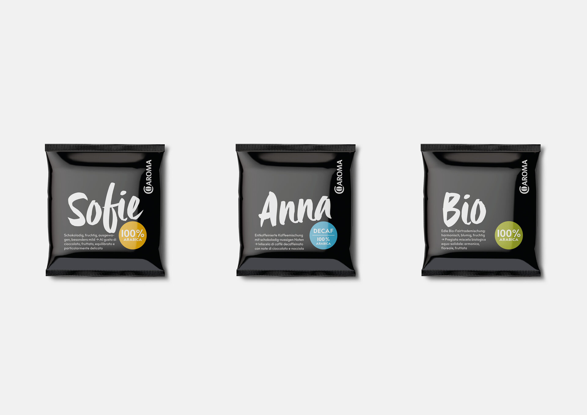
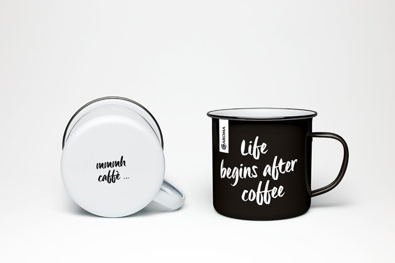
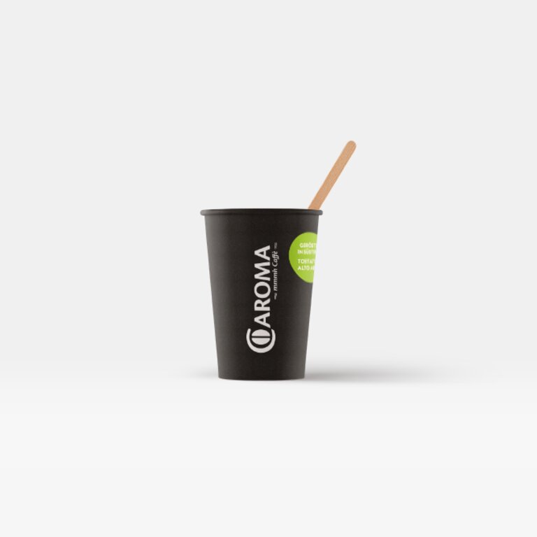
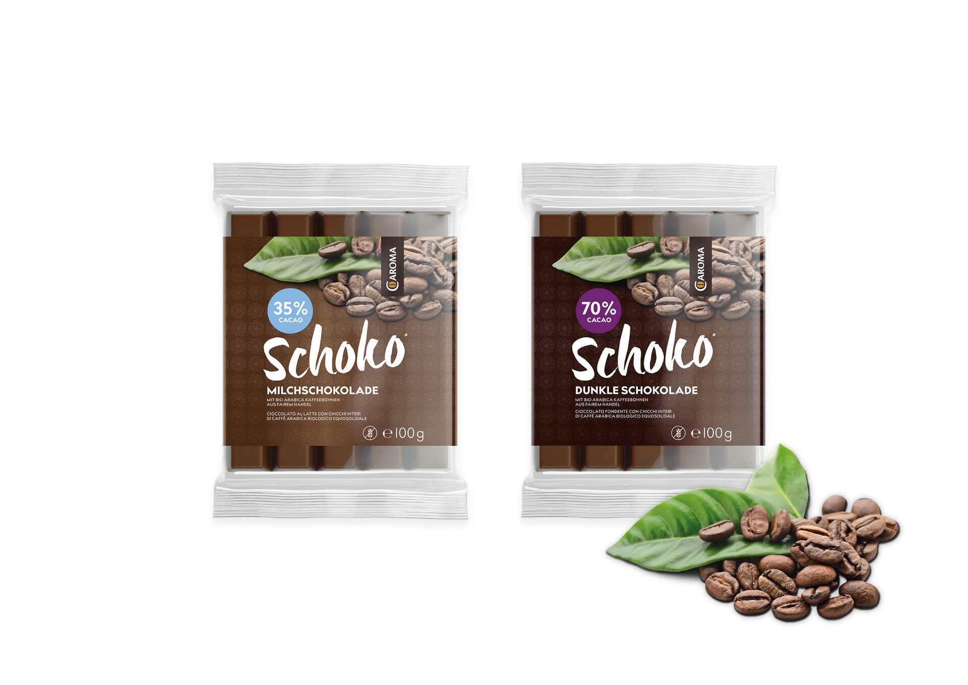
In addition to the coffee world in Fiè allo Sciliar, coffee connoisseurs encounter the Caroma brand at countless other times. In order to create a consistent coffee experience, a variety of different areas of expertise are lined up in our studio: from the subtle logo facelift to the eCommerce shop; from videography to social media; from coffee catering equipment to events; from HORECA packaging to gourmet coffee specialities.
And we love coffee today more than ever — the Caroma coffee story continues to be written.

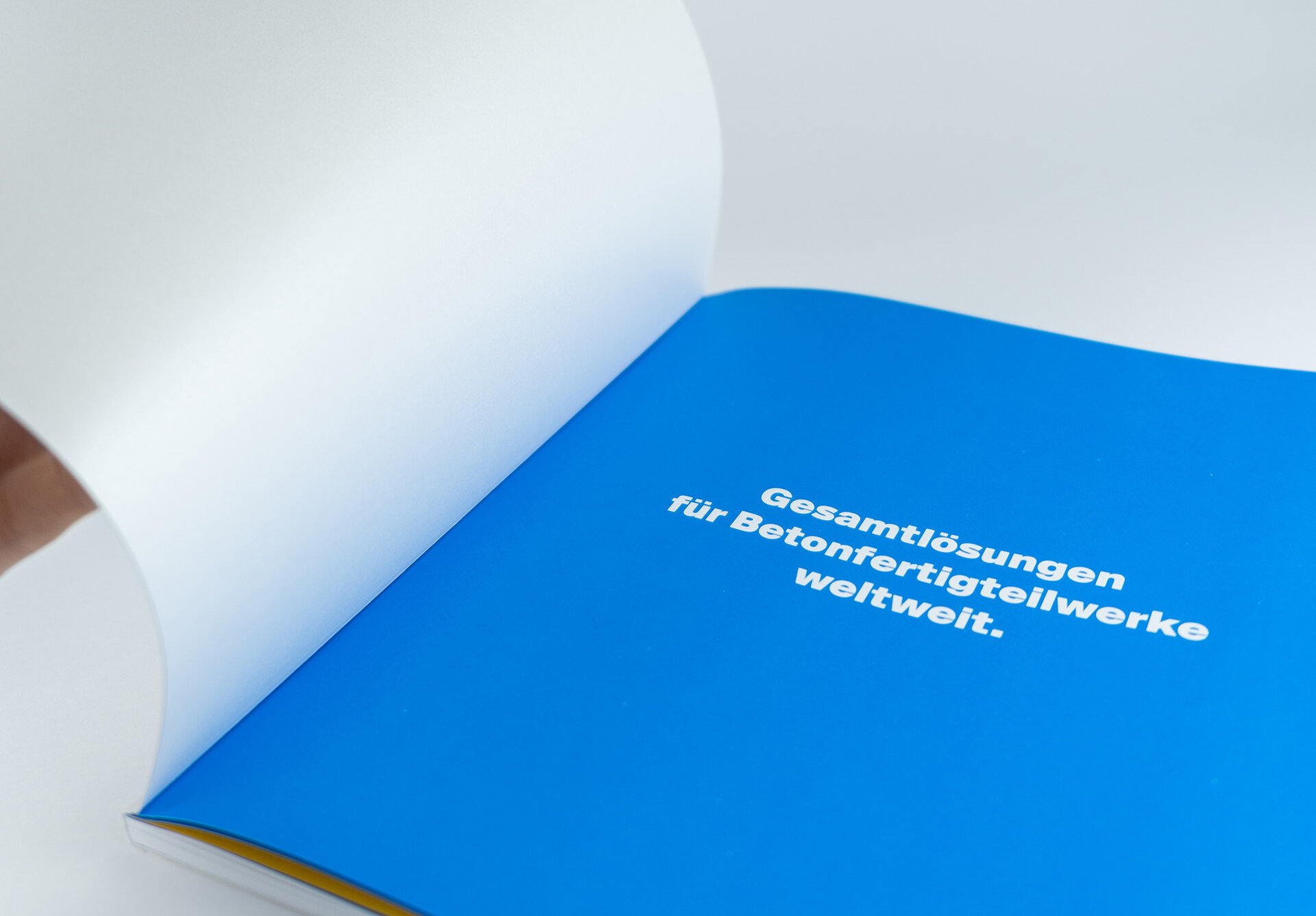
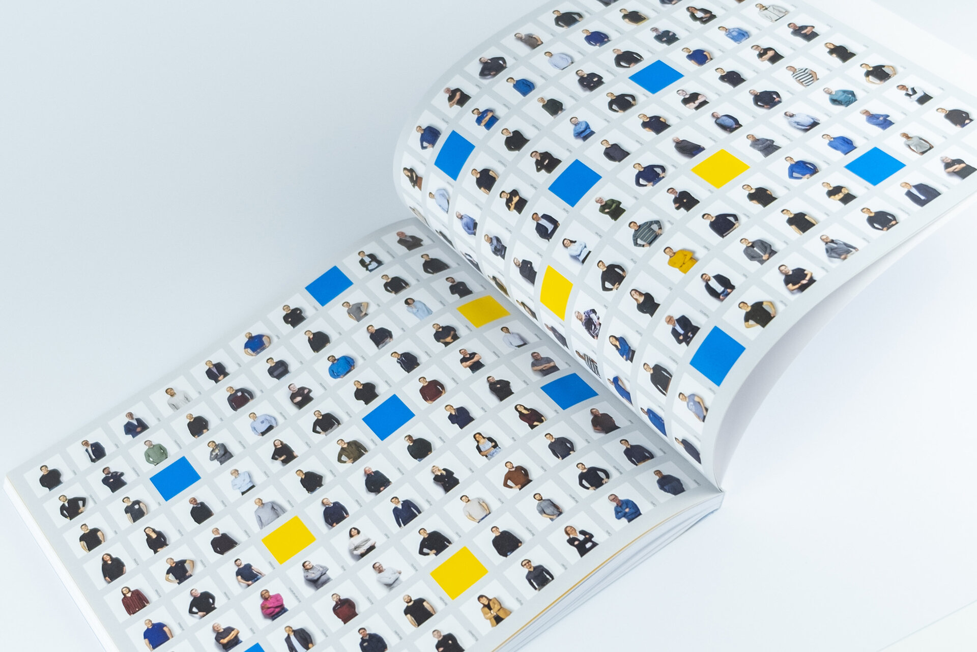
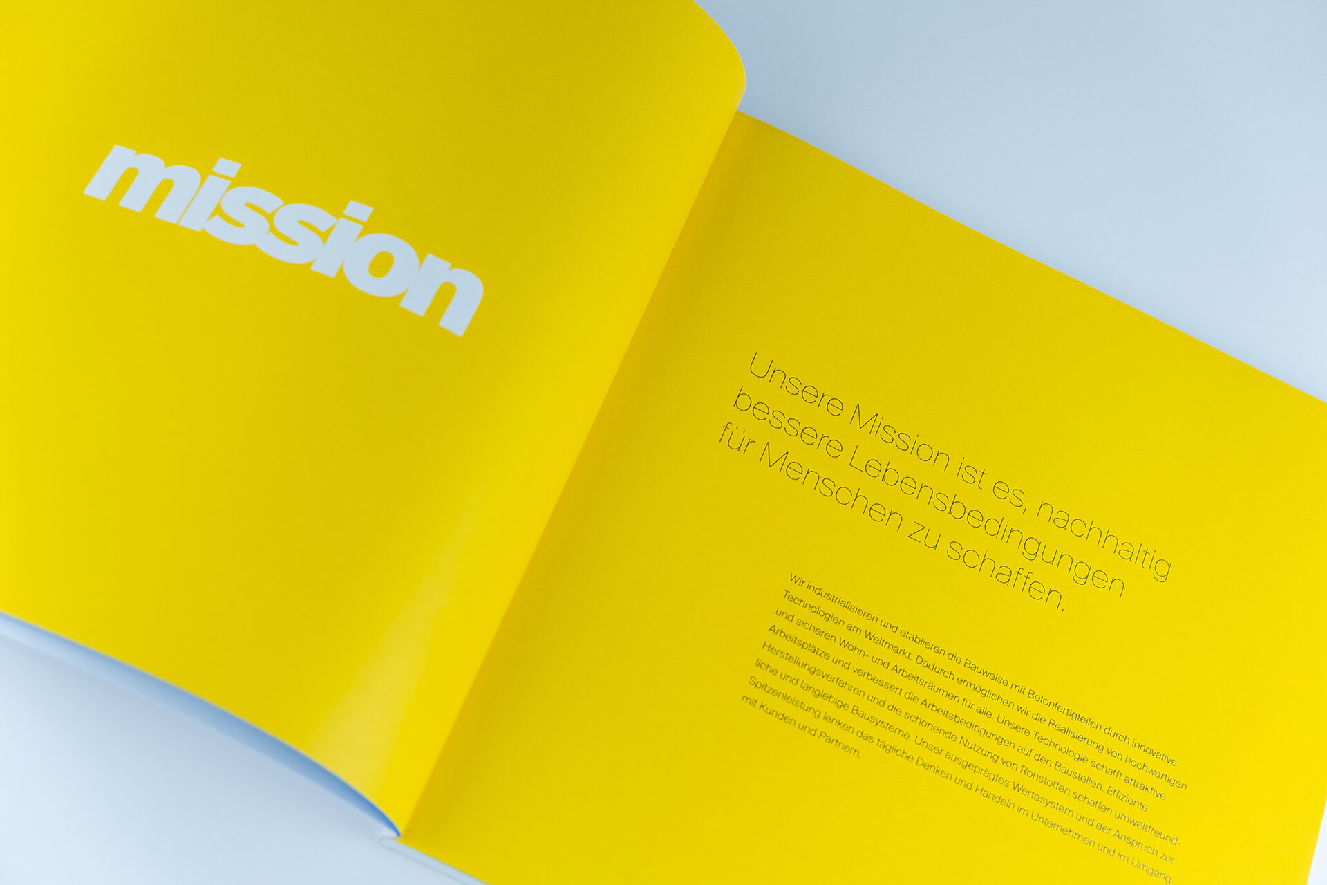
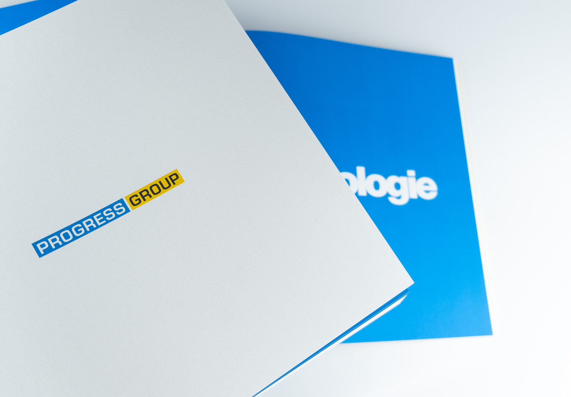
The PROGRESS GROUP is the market leader in the field of technology for precast concrete plants and employs more than 700 people at its locations worldwide. An image brochure was developed with the aim of communicating the company's strength and innovative spirit and positioning itself as a future-orientated company.
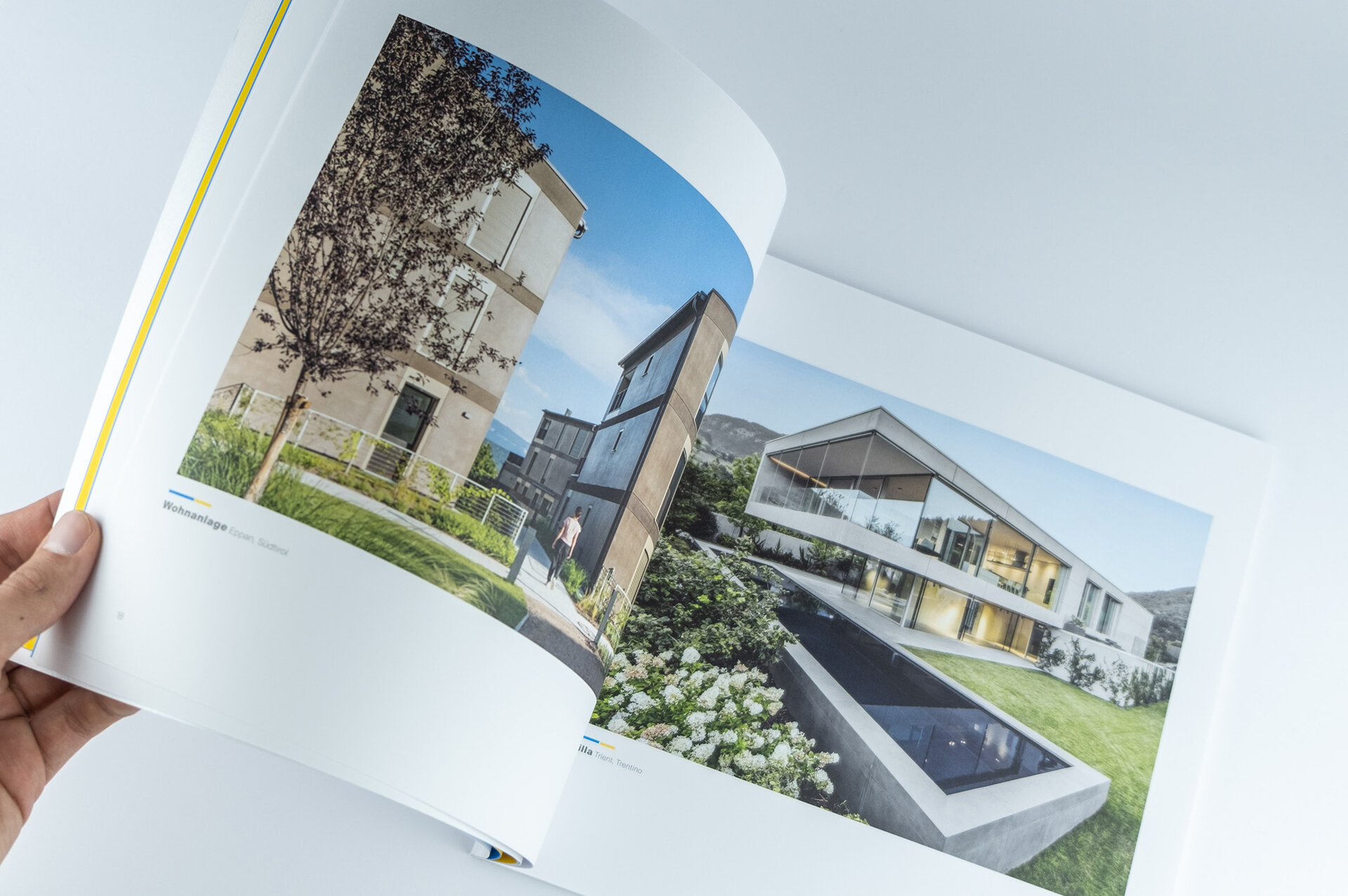
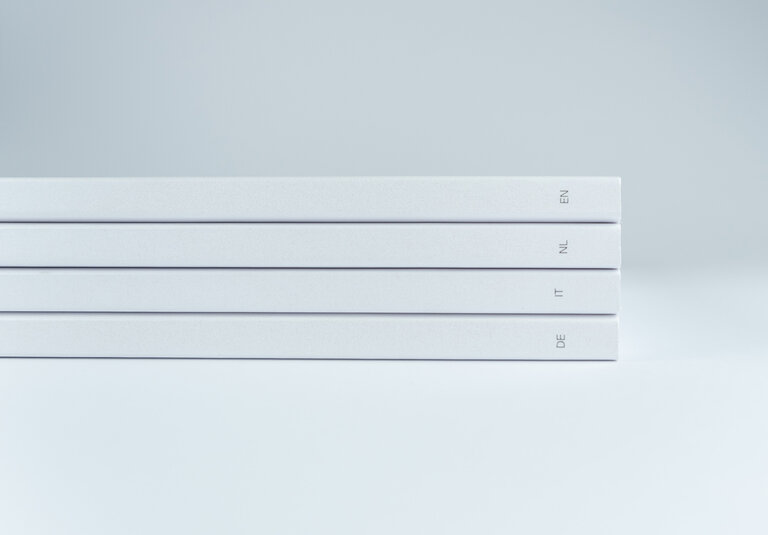
This is aimed primarily at the company's own employees, but also at partners such as property developers, bending companies, mesh manufacturers and precast concrete plants. A clear design and large images with plenty of white space provide the basis for the brochure. The choice of a high-quality material was also essential: the cover, a Sirio Pearl Ice White paper, with its mother-of-pearl effect, ensures a special, glamorous brand appearance. The image brochure was printed in 10 languages, including French, Spanish, Chinese and Russian.
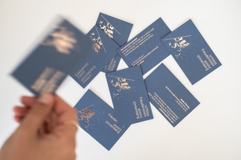
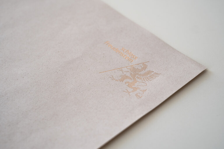
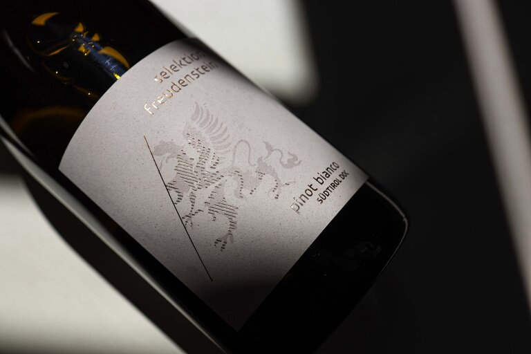
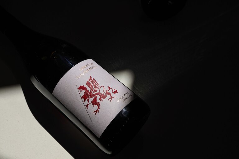
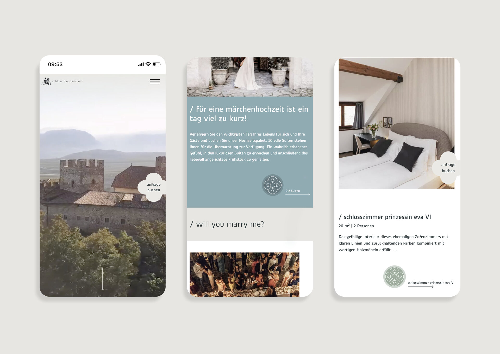
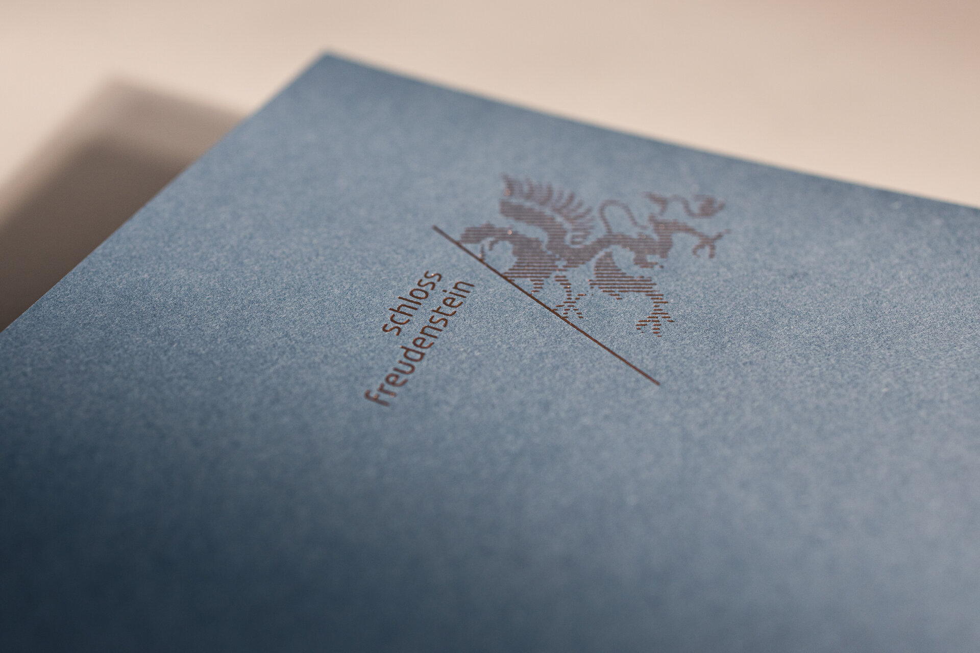
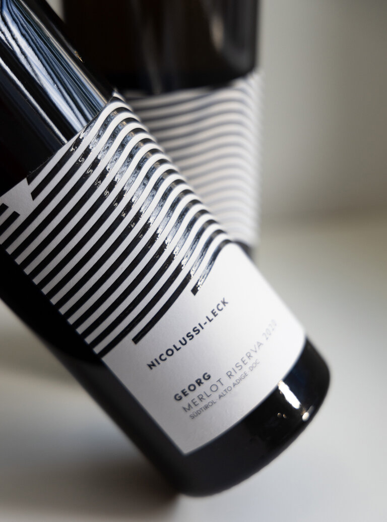
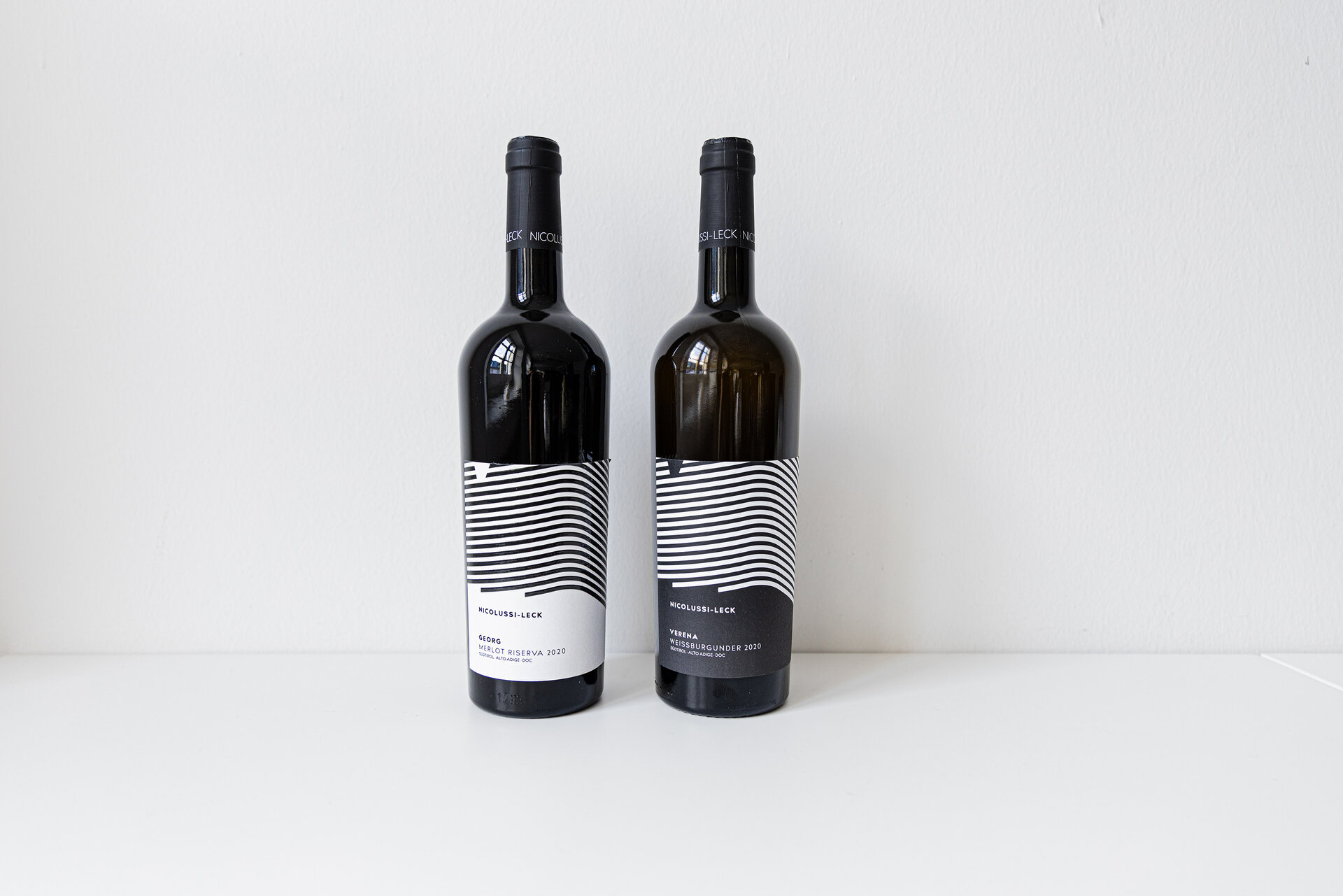
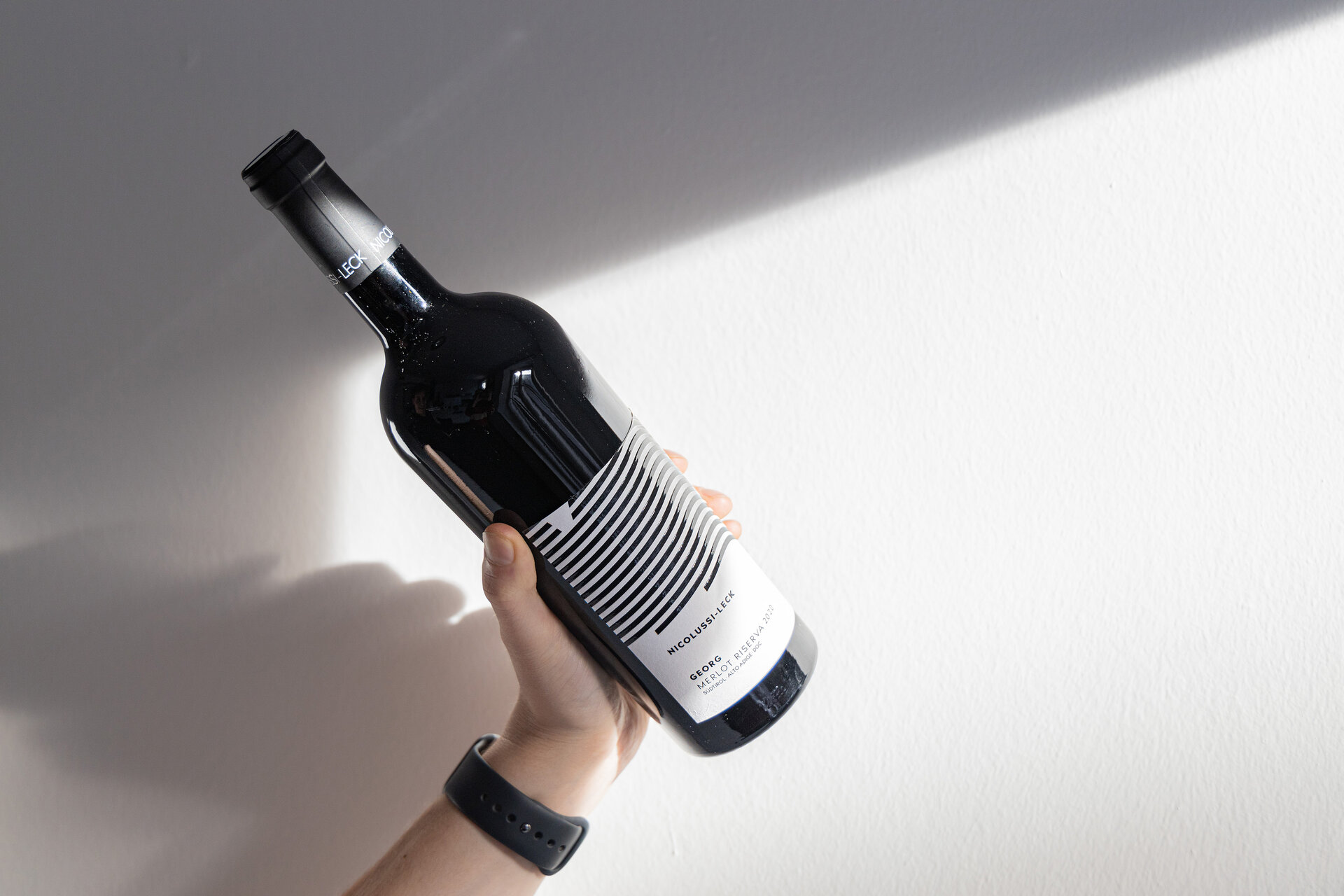
Hidden behind the thick, old walls of Freudenstein Castle is a place bursting with magic, warmth and attention to detail. Karoline Fink, the lady of the castle, and her son Peter Gostner are responsible for the former aristocratic residence. It's a family business! And you can feel it. Over a period of five years, the castle and the neighbouring Zinnenberg residence were restored with great taste and respect for the history of the house dating back to 1275. The castle has been filled with new life — and it is precisely this flair that the new design should express. The appearance of Freudenstein Castle in Eppan is timeless, elegant and extraordinary. Starting with the logo, which shows the griffin watching over the castle, through to the website, which immediately evokes a sense of well-being with its refined details and modern, elegant colours.
The corporate design in the print and packaging area is supported by the choice of high-quality materials. Copper-coloured finishes and tactile embossing adorn the visual appearance: from the business card to the wine and apple juice labels.

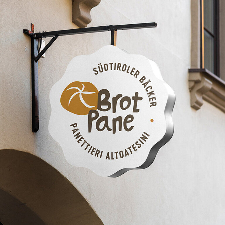
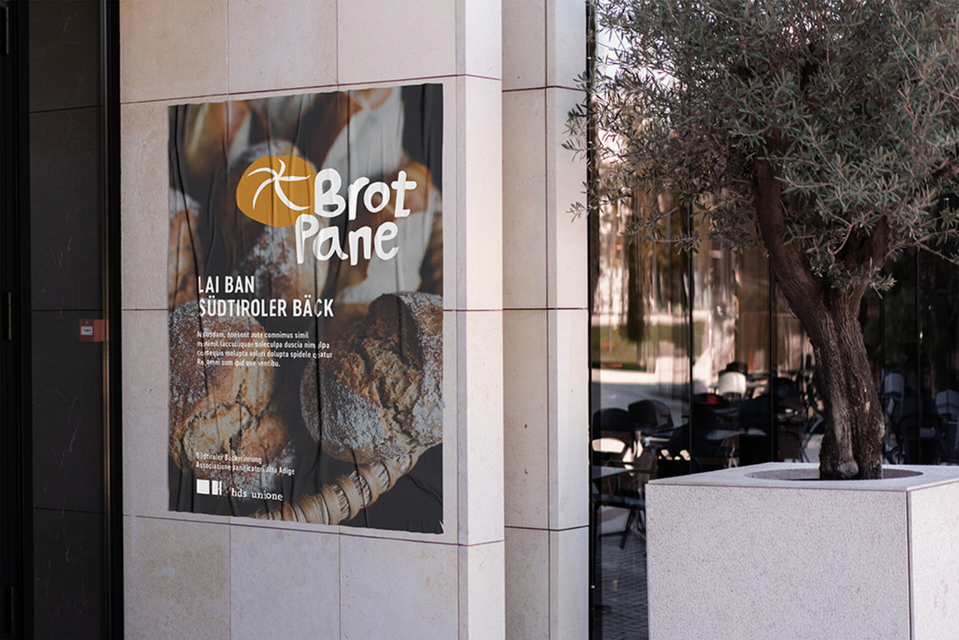
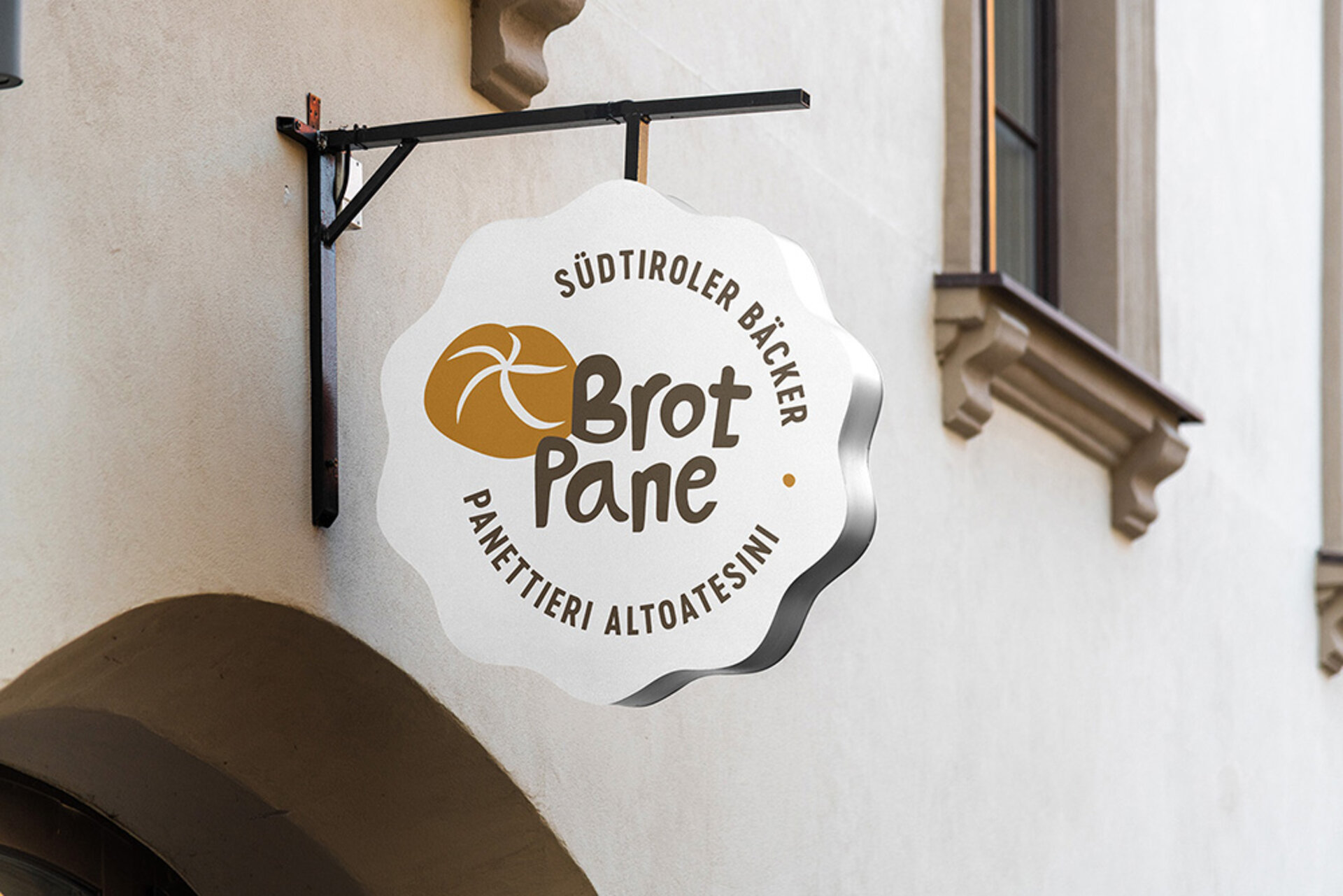
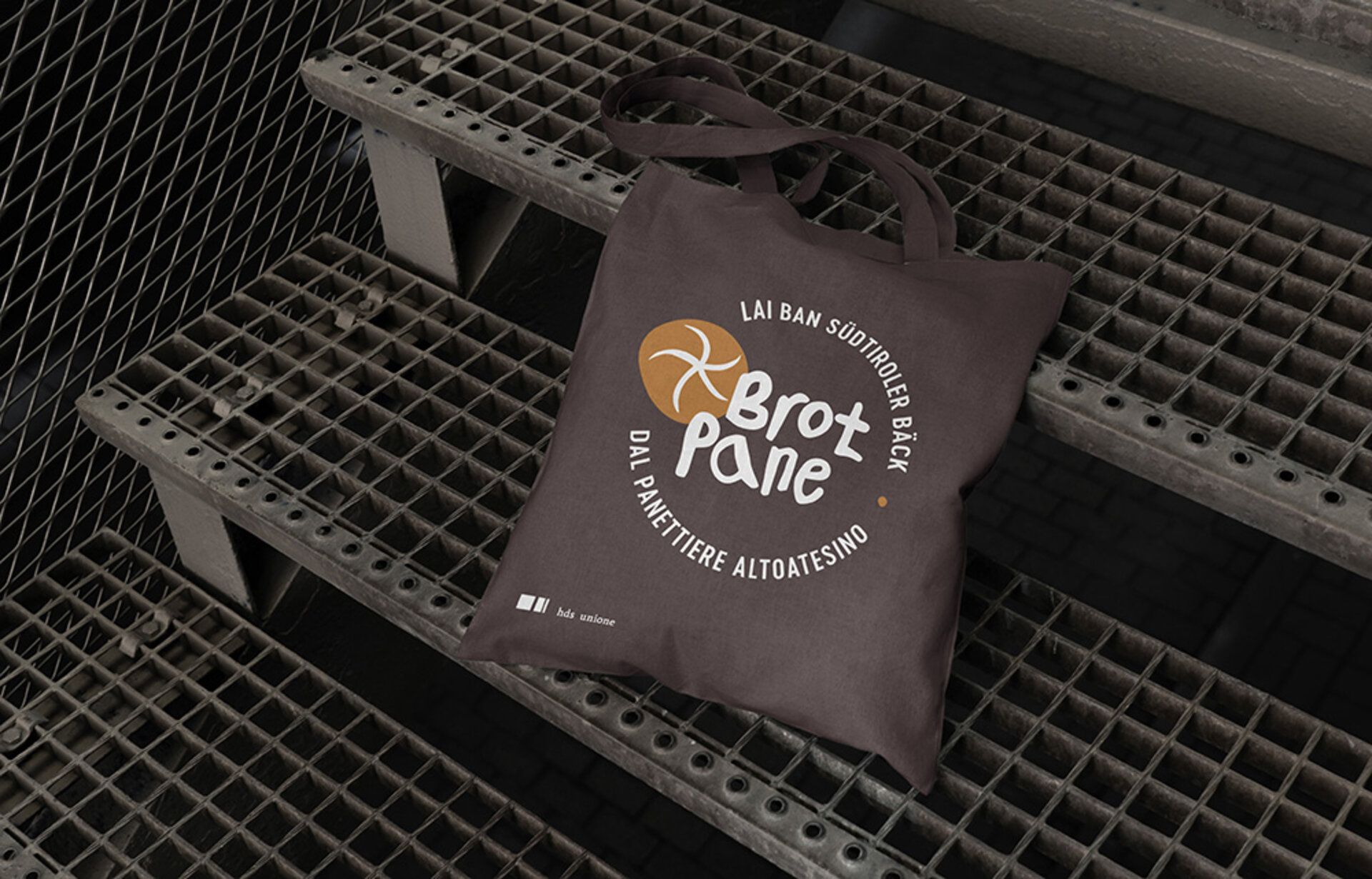
The South Tyrolean Bakers' Association has around 90 member businesses and now has around 220 branches. The baking profession is still one of the most important and traditional professions in South Tyrol. In the member businesses of the South Tyrol Trade and Service Association, master bakers work according to tradition, with a great deal of expertise and innovation.
We have developed a new logo for the contemporary appearance of the association. The circle was used as a symbol to represent the community of the bakers' association. Both language groups were included in the logo. The stylised bread roll with its five loaves — probably the guild's best-selling product — is instantly recognisable. The colour palette is inspired by the authenticity of the product and the warmth of the oven. Thanks to its structure and conciseness, the new logo perfectly fulfils the requirements of social media channels, which are increasingly being used to address young employees.
Chocolaty, sweet, irresistible — these are the creations of Patisserie D'Amor in Lana. The young, motivated owners commissioned us with the naming and corporate design of their new patisserie. The appearance should reflect the character of the desserts: Noble and artful piece desserts, where every bite is an experience. Cakes on request and delicious chocolates. High-quality and elegant, yet very down-to-earth; the focus is on craftsmanship with natural ingredients. From the naming to the colour concept, photo shoot, website and social media presence, the stylish patisserie presents itself in a uniform way. The brand identity is coherent and appeals to curious and pleasure-orientated customers.

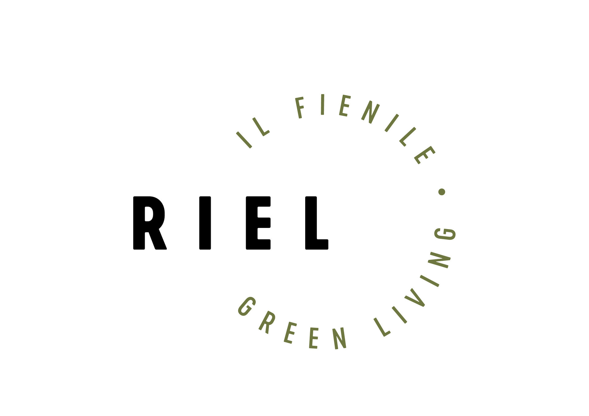
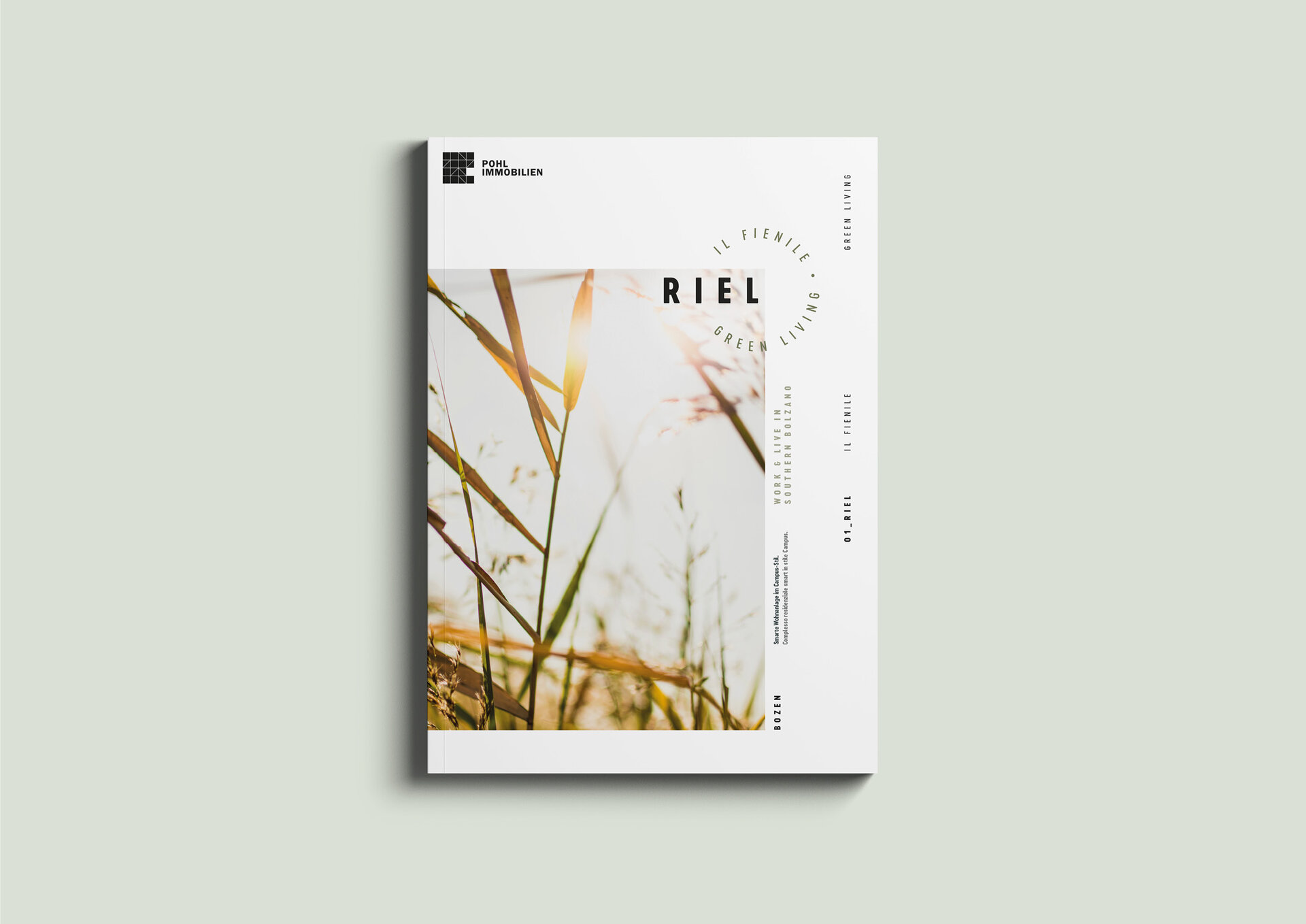
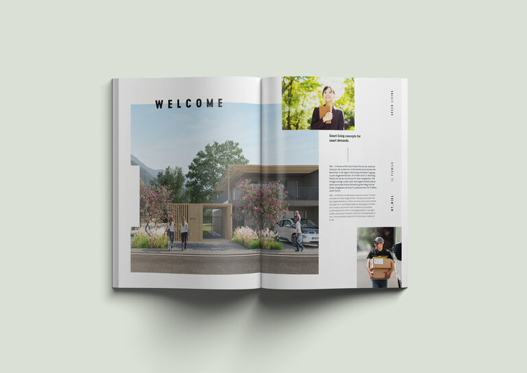
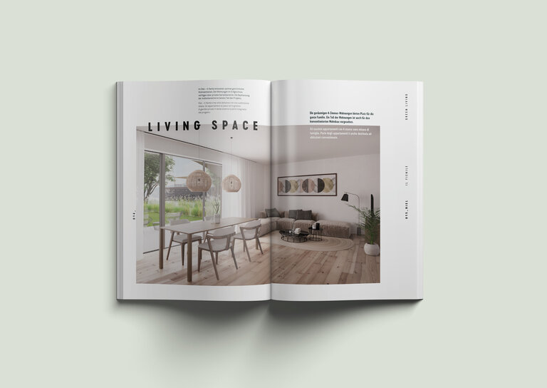
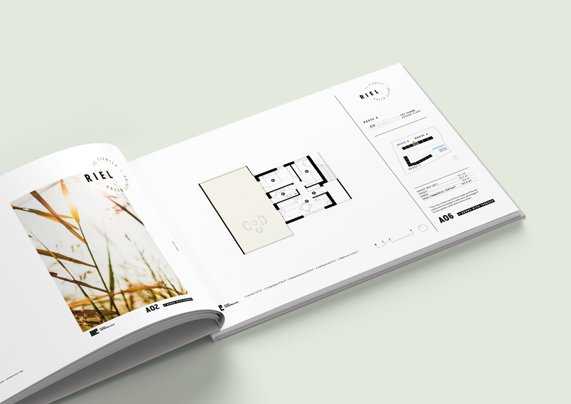
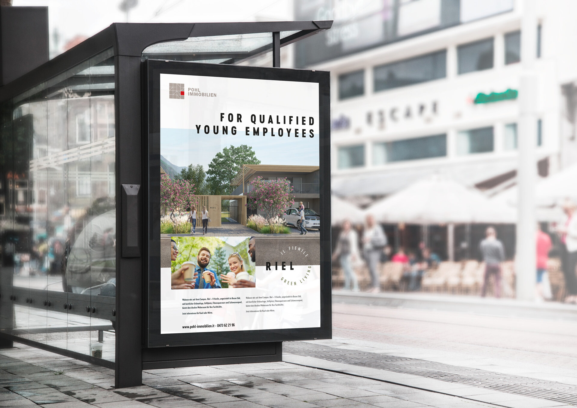
Riel, il fienile — stands for a contemporary residential project in the south of Bolzano — for young, sporty people with an awareness of historical buildings and timeless design. The design language of the building complex was specified by Monovolume Architects; the corporate design we developed continued this idea. The logo design was followed by standardised, clear sales documents.
The visionary attitude of Pohl Immobilien paired with the ideas of the architects and the design expertise of Brand Gorillas led to a successful overall concept.

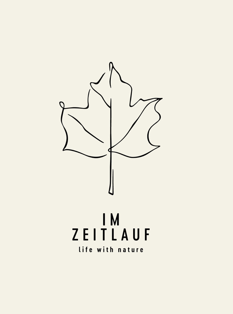
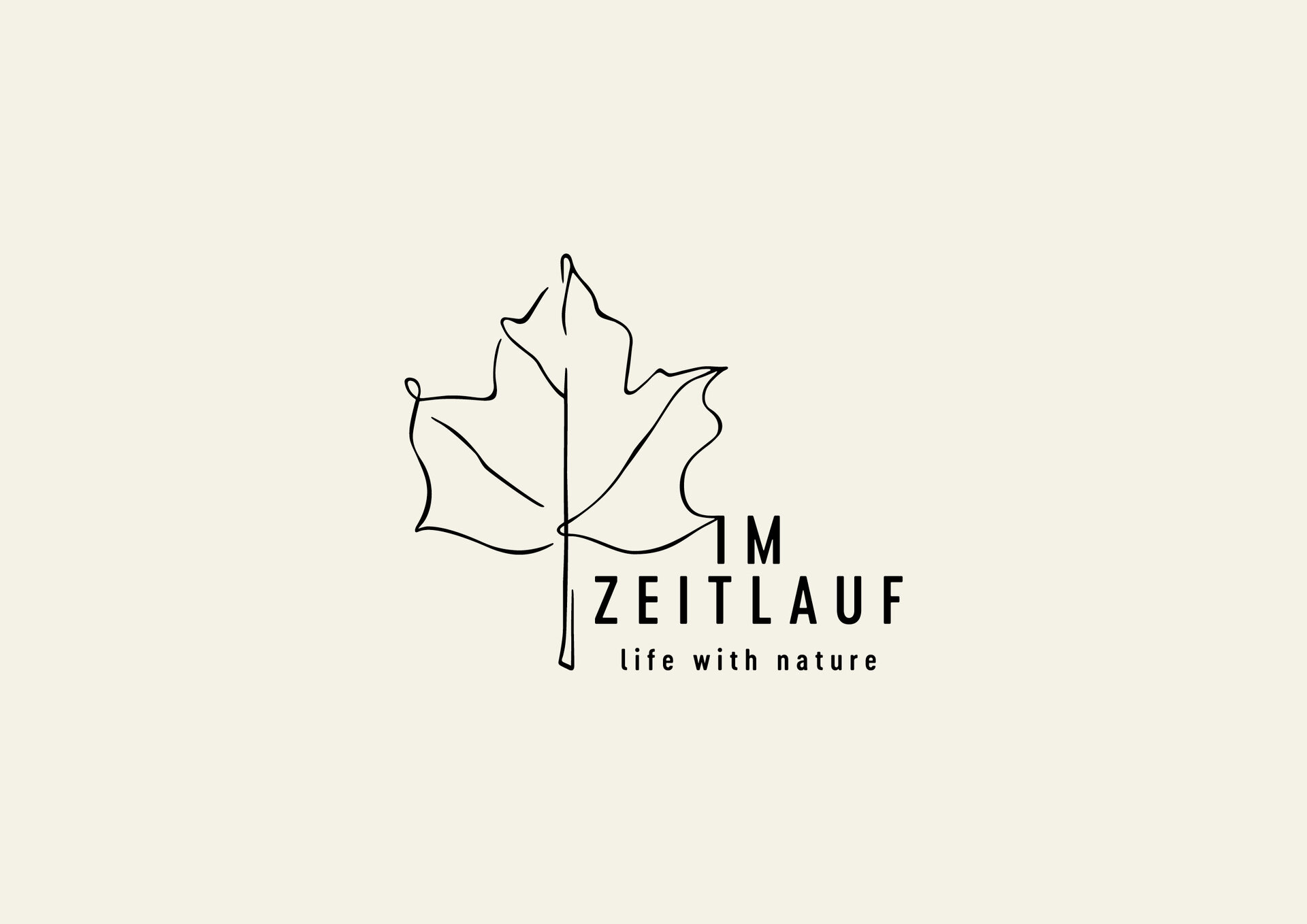
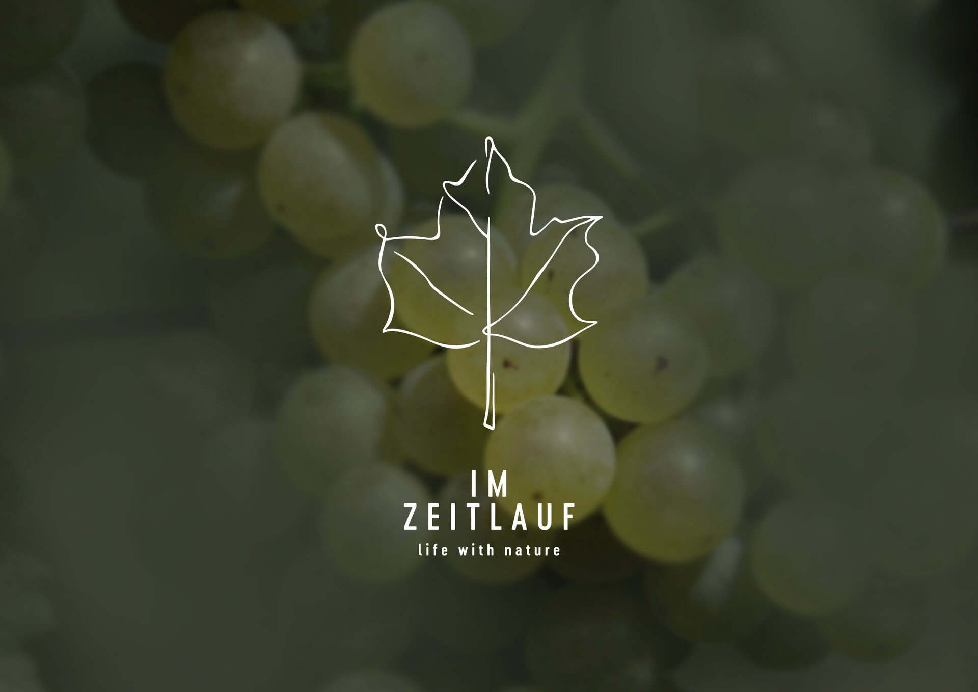
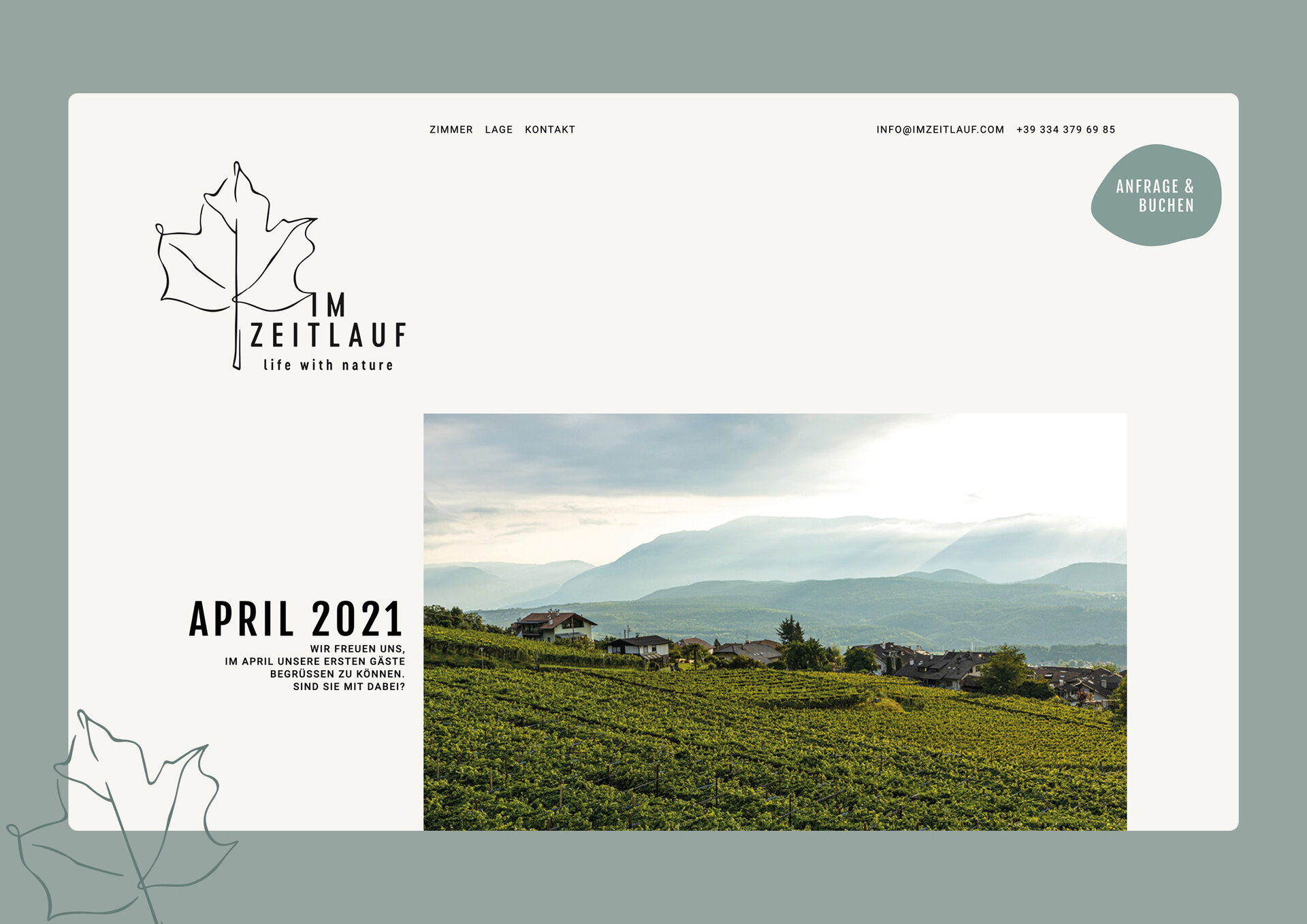
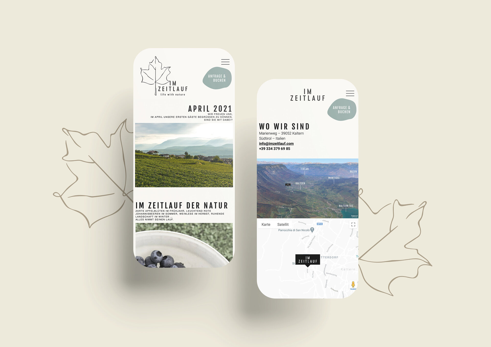
The "Im Zeitlauf" is a farm in Kaltern, mostly self-sufficient, with 8 guest rooms surrounded by greenery. The two young owners, Lukas and Lena, have made it their mission to bring guests closer to nature and offer a holiday that is as sustainable as possible. From the delicate apple blossom in spring to the bright fruits in summer, the grape harvest in autumn and the resting phase in winter: Everything has its natural course at the farm, hence the name "In the course of time".
For this heartfelt project, a design concept had to be created that would bring the wonderful holiday offer — with nature as its greatest treasure - closer to the guests. When creating the logo, it was important to stylise the naturalness and attention to detail. The result is a high-contrast word and figurative mark: light brushstrokes and stable typography. The colour concept is in natural tones: brown like the earth, in combination with great natural papers for the printed matter. The concept of "Im Zeitlauf" is also continued on the website: large, expressive images on a beige background with the most important information in a relaxed layout.
The Hotel Seeleiten on Lake Kaltern is THE hideaway for numerous tourists and underwent a refurbishment last winter. In addition to the new infinity pool, suites and reception area, the corporate design also required a new coat of paint. We gave the logo a slight facelift. A new colour concept was created to match the Alpine-Mediterranean flair of the hotel. A special design element is the Seeleiten pattern, which emerges from simple shapes and gives the hotel corporate a young, fresh touch.
The job website was also designed in the new corporate design, so that potential employees can also feel the young, motivating flair of the hotel.